

Why aim for a painterly look?
Realistic 3D is great, but sometimes you want personality, brushy strokes, imperfect edges, and color variation that feels hand-made. That look helps scenes or objects feel more expressive and unique. My goal was simple: keep the 3D base (lighting, forms, materials), but nudge the textures and surfaces to read like an illustration.
I walk you through a series of techniques pushing 3D textures toward a hand-painted, illustrative style all within Substance 3D Painter and without breaking a non-destructive workflow. I start with the Path tool to create editable decorative strokes, then move into the Stylized filter for adding visible brushwork. From there, I use an anisotropic smudge (similar to the Kuwahara filter) to give surfaces a streaky, directional paint feel. I also cover how Directional Distance paired with a Soft Light blend can boost contrast and help strokes blend more naturally. On the technical side, I show how grayscale conversion combined with anchor points can drive height from tonal values, and how Quantize can simplify those values into bold, stylized bumps. Finally, I demonstrate how these methods can be layered over stylized models or smart materials to achieve a cohesive, expressive look.
Editable ornament strokes with the Path tool
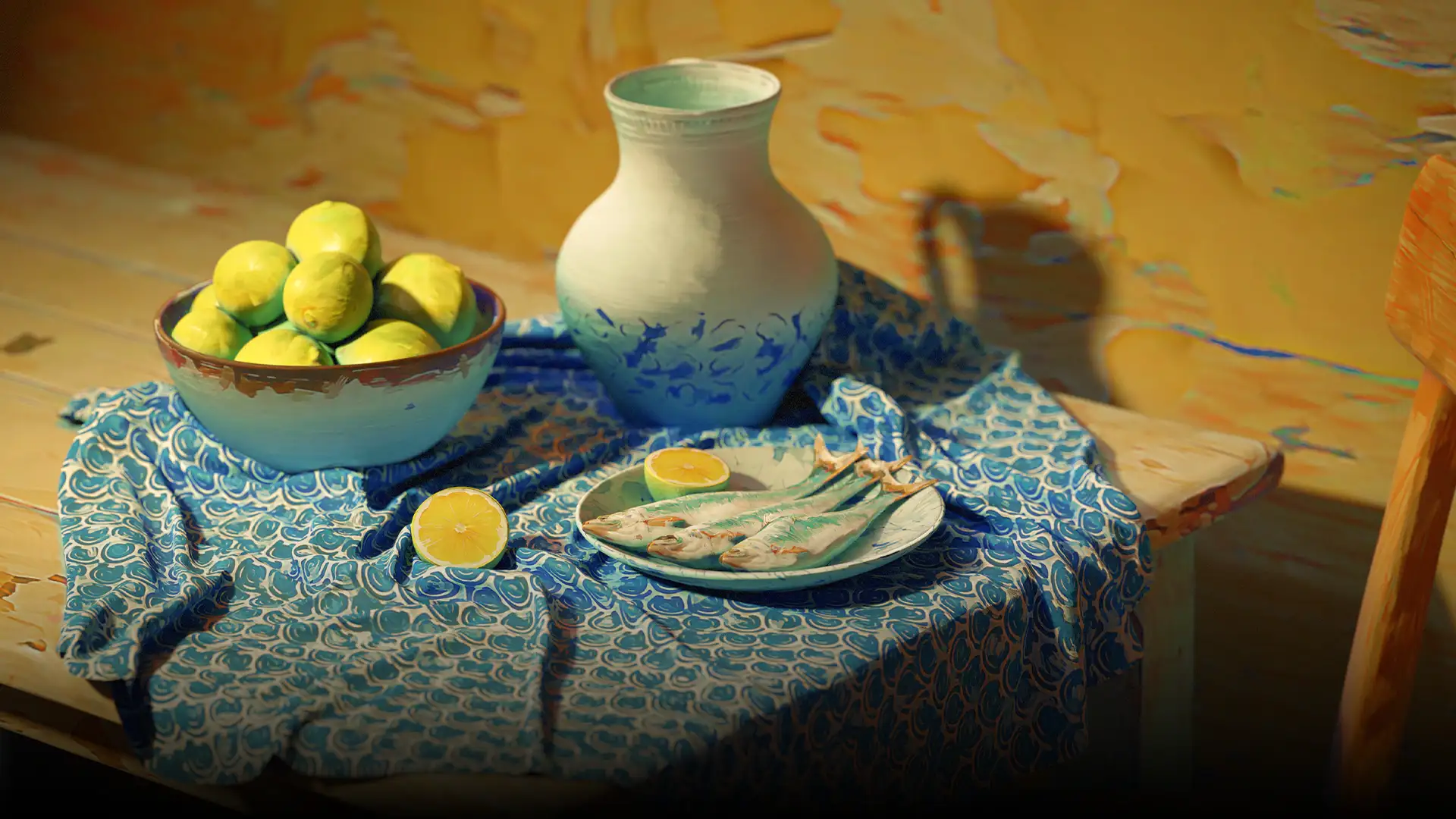
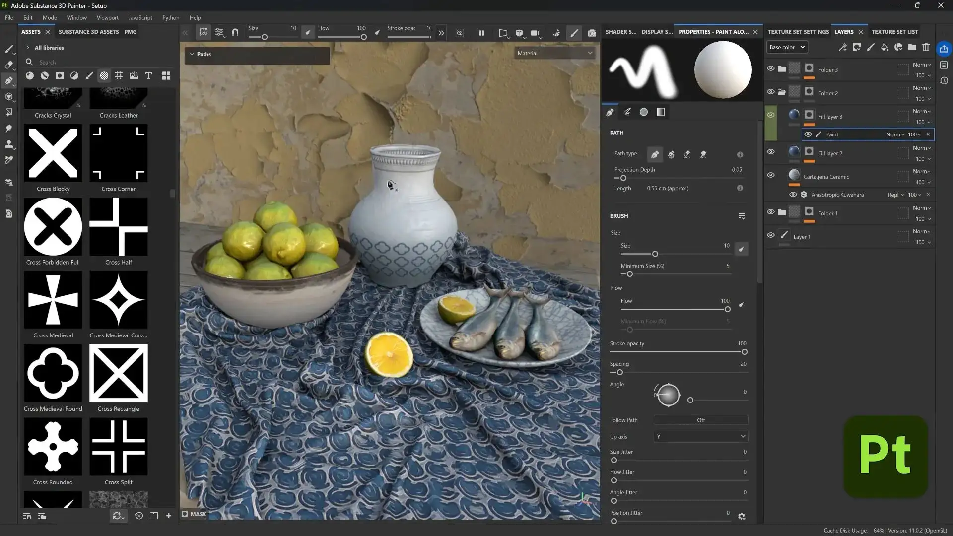
Starting with the ceramic jug, I start small using a fill layer, a black mask, and a paint effect inside that mask. Then I click around the ceramic jug to paint a precise line using the path tool. That by itself isn't revolutionary, but the path tool is editable. You can move the points, change the curve, adjust spacing, change the alpha, and none of it destroys your layer.
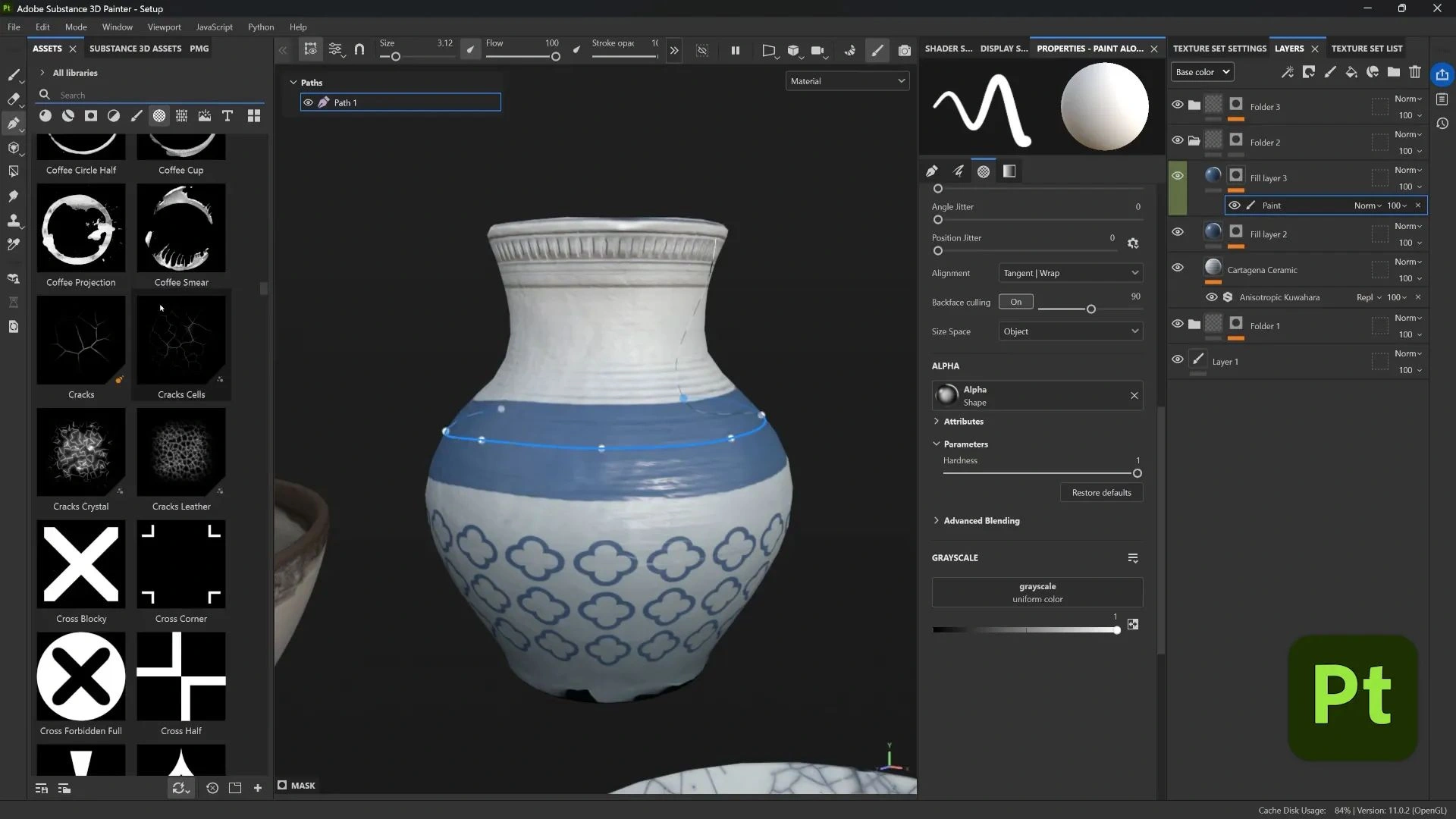
From there, I swap the brush alpha for any black-and-white ornament image often something simple, since it doesn’t need to be overly detailed. Adjusting the brush size and spacing controls how the pattern flows along the path, and duplicating the path lets me create parallel rows or variations. A quick nudge to the control points breaks up any mechanical repetition. Because every step stays editable, I can experiment freely testing different ornament patterns, tweaking spacing, or swapping in an entirely new alpha all without repainting. It’s a fast way to add intricate, hand-crafted detail to ceramics, fabrics, or other surfaces without manually placing every stroke.
Adding brush strokes using the Stylized Filter
For the sardines object, I started with a photo projection for texture, but it looked too photographic. I wanted it to read as paint. Enter the Stylized filter from the filters library.
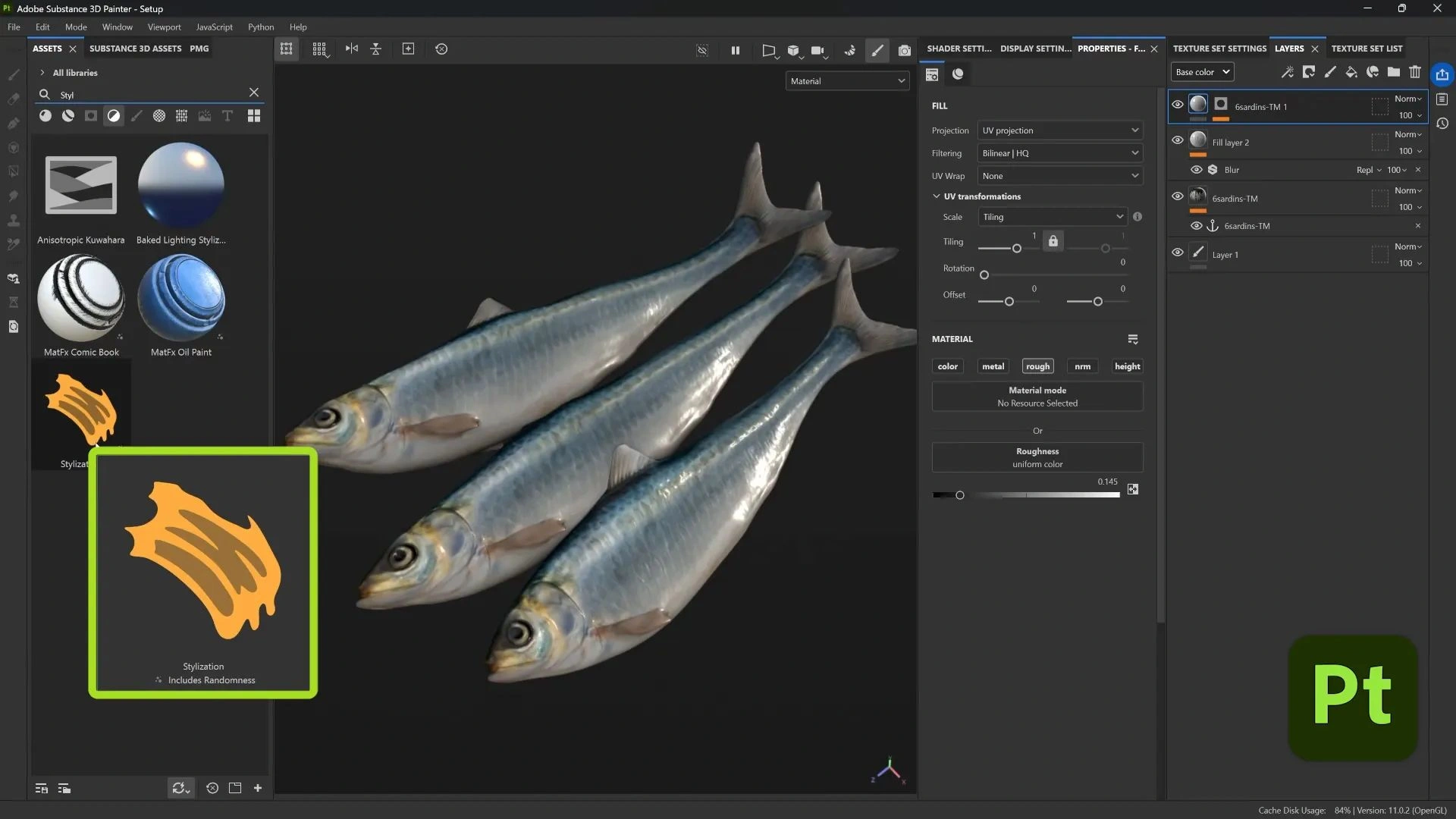
Drag-and-drop the Stylized filter onto your texture stack, and you’ll see it immediately. The filter includes presets, but I typically reset to default and make adjustments. The Stroke Amount setting controls how many individual brush marks appear across the surface, while Stroke Type and Stroke Size define their overall character and scale. To push things toward an impressionistic style, I like to raise the Brush Stroke Effect’s Color Variation, which causes each stroke to shift slightly in hue, creating a rich, painterly feel that mimics the subtle pigment changes of traditional hand painting.
You can also add a Sharpen filter on top of Stylized and enable only the Color channel in that Sharpen filter. That separates tonal blocks slightly and gives better color contrast between strokes without affecting height or roughness.
Directional Smudges with the Anisotropic Kuwahara Filter
On the damaged plaster wall I used a material from the Painter assets as a starting point. It has nice value variation, which is perfect for this technique. I dropped in the Anisotropic Kuwahara filter (name might be spelled differently depending on Painter version) and the result is a directional smudge. Think finger-painted smears that soften and blend colors in a direction.
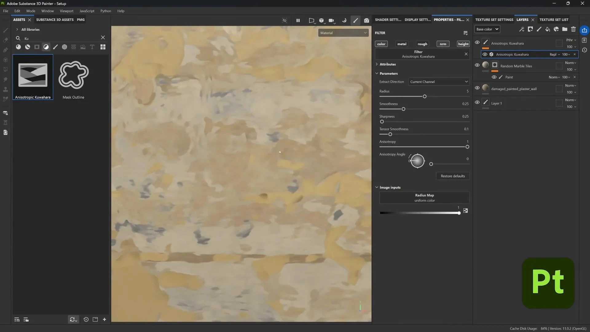
This filter transforms noisy, photographic textures into soft strokes and broad bands of color, replacing high-frequency photographic detail with painterly smears. By adjusting the angle, strength, and other sliders, you can dial in just the right amount of smudge to soften realism without losing the underlying form.
I treat it like a digital dry-brush experiment with settings until the surface feels like paint rather than a photo projection.
Directional Distance and blend modes to refine and boost contrast
The Directional Distance filter acts like a directional blur (similar to Photoshop's directional blur), but in Painter. I used it on the sardines and the tablecloth to soften strokes and to add subtle color contrast, but it can desaturate or wash colors if you don't handle blending.
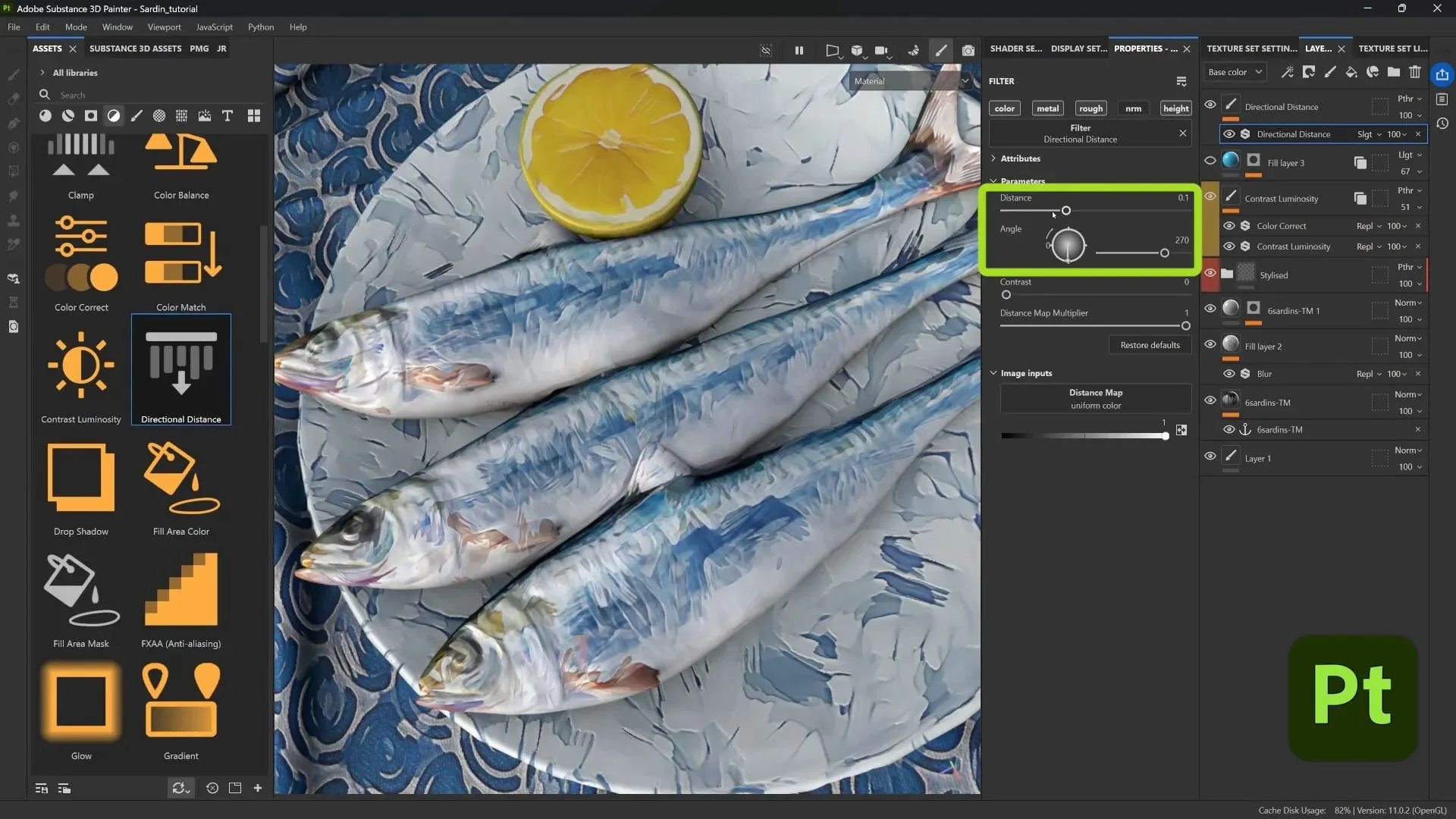
For a final polish, I like to use the Directional Distance filter to soften and unify strokes while enhancing contrast. After dropping it onto the texture, I set the angle and distance to blur in the direction I want the strokes to flow. Then, instead of leaving it as a plain blur, I change the blending mode so the effect merges back into the texture, boosting contrast and naturally brightening colors. This small adjustment can make a painterly surface feel richer: blues become more vibrant, subtle highlights emerge, and edges blend just enough to read as hand-painted strokes.
Using Grayscale conversion and anchor points to drive height details non-destructively
This is one of my favorite little tricks because it lets you convert color variation into actual height or bump detail, and it’s all procedural and editable.
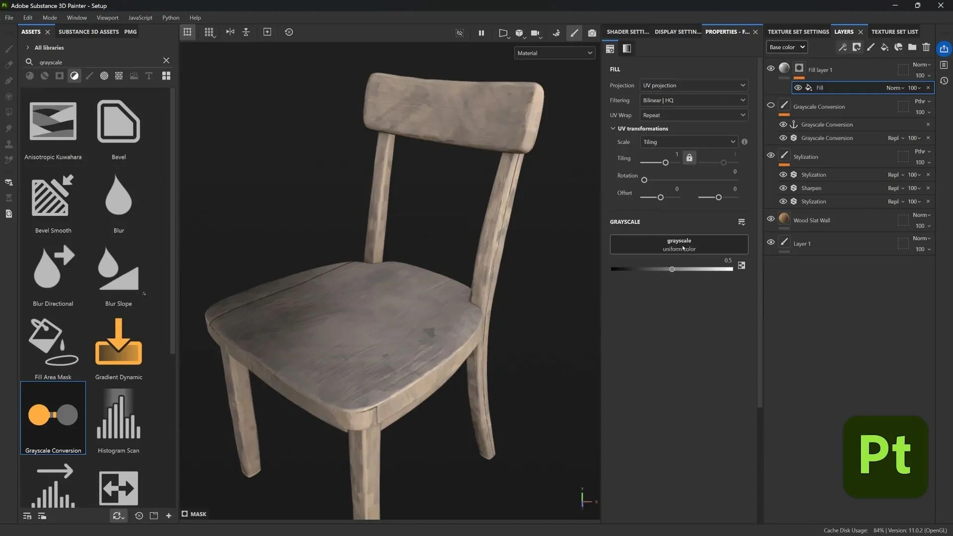
To drive height from tonal values, I start by adding a Grayscale Conversion filter to a paint layer, which gives me a grayscale version of whatever’s beneath it. I can then tweak the grayscale settings to isolate the values I want, boosting contrast, targeting midtones, or dialing in specific ranges. Once I have my desired image, I drop an Anchor Point on the paint layer and turn the layer off; the anchor still keeps the grayscale result. Next, I create a new Fill layer with a black mask and add a Fill effect inside that mask. For the Fill’s input, I reference the Anchor Point from earlier, but I only enable the Height channel so the grayscale map drives sculpted height details without affecting the color.
This results in the hidden grayscale image now becoming a procedural height map. Lighter values push height, darker values recede. Because it's driven by the anchor point, you can still tweak the original grayscale conversion and see updates reflected in the height, all nondestructive and reversible.
Simplifying tones using the Quantize filter to create graphic bumps
For the lemons, I wanted a very graphic bump detail that follows strokes. The Quantize filter is perfect: it reduces the grayscale to a set number of discrete values.
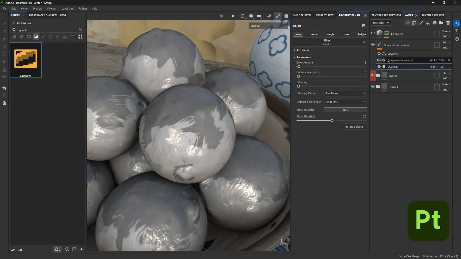
To create bold, stylized bump details, I place a Quantize filter directly beneath the Grayscale Conversion in the paint layer. I keep the value count low to reduce the texture to simple light and dark tones, then use contour smoothing to tidy up any jagged edges. With the Grayscale Conversion active again, the surface now shows only these simplified tonal areas. Because the Fill layer is still referencing that grayscale anchor to drive height, those flat tones become crisp, sculptural bumps that follow every brush stroke. It’s a small adjustment that transforms subtle shading into strong, hand-carved forms perfect for when you want a surface with graphic punch.
Mix, match, and experiment: don’t be afraid to combine filters
All of these techniques are modular, so you can mix and match them in countless ways. You might layer Stylized with Anisotropic smudging and Directional Distance for a rich, blended painterly surface, or combine Grayscale Conversion with Quantize and Height for bold, sculptural bumps. In other cases, Stylized followed by a sharpen filter on the color channel can add crispness without affecting geometry. The exciting part comes from experimenting, stacking filters in different orders, and seeing how their interactions create new, unexpected results.
Always keep things nondestructive. Use masks, anchor points, and filters in the stack, and you’ll be able to tweak any parameter without repainting or reprojecting.
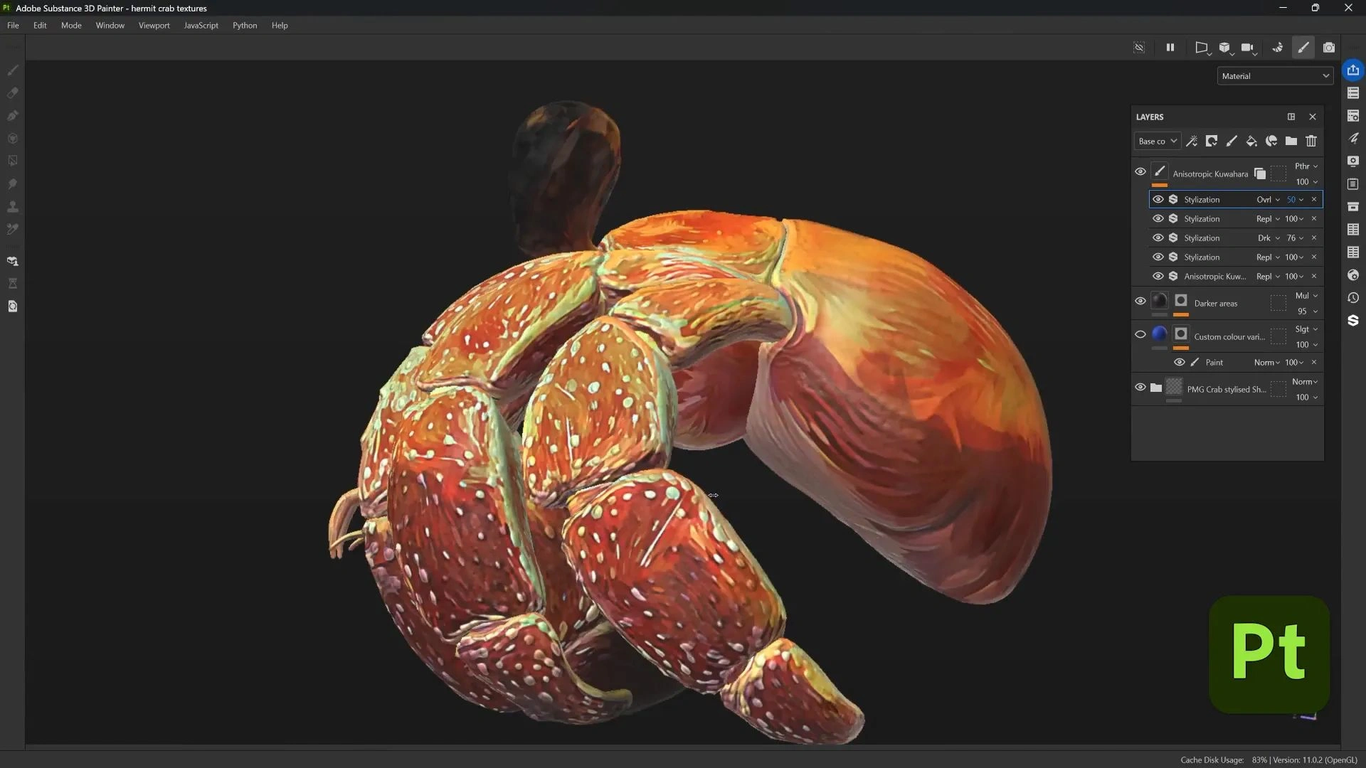
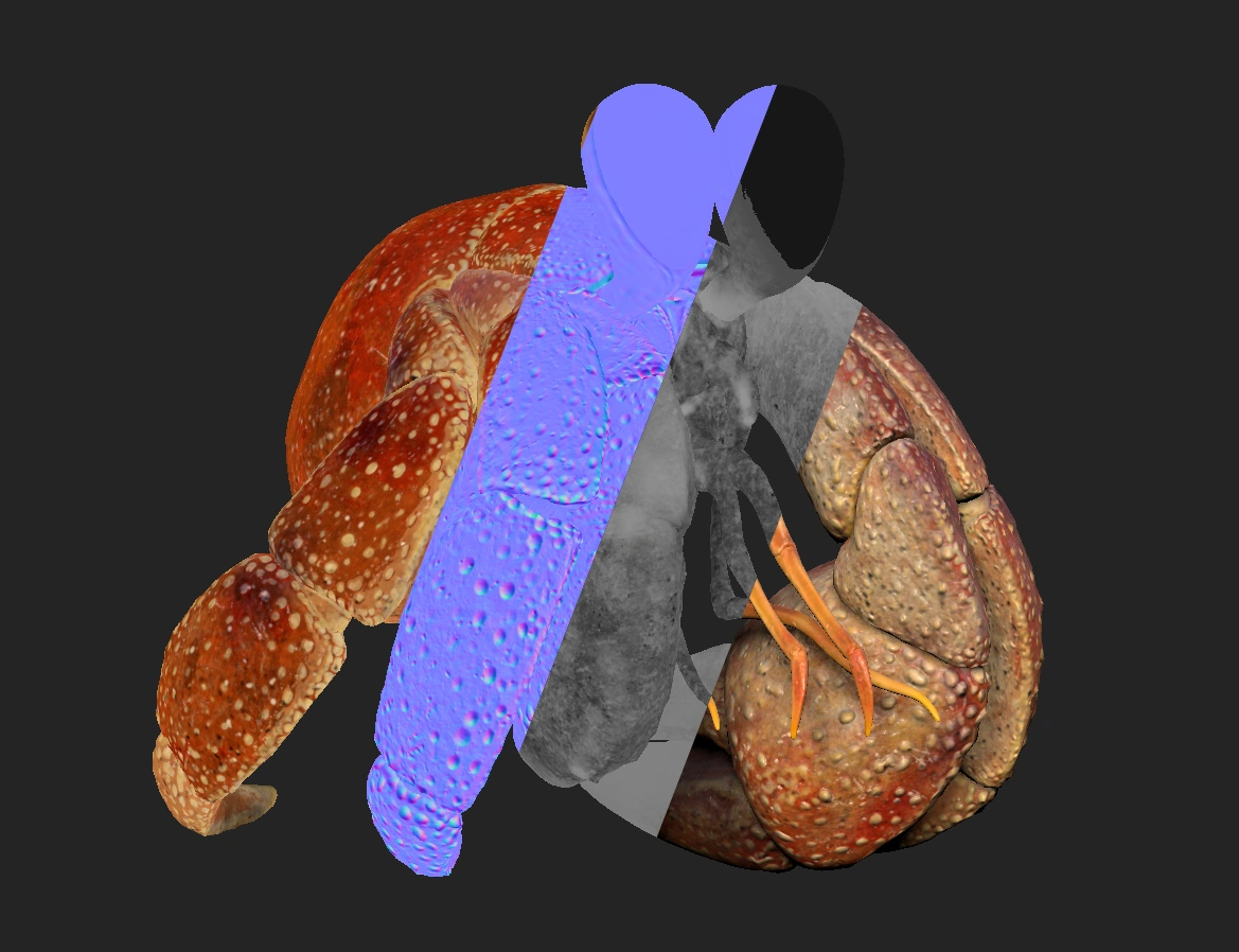
Apply these techniques to stylized models and smart materials
If your model is already stylized (for example, a smart material I made for a crab project), these filters just amplify that style. I have a full video on how I made that crab smart material. Combining modeling style with Painter filters makes the final look cohesive and strong.
Try layering these effects on top of a stylized base mesh: the shape language of the model plus painterly textures results in a very readable, unique illustration-like render.
Wrapping up
This whole approach is about taking procedural tools and creative filters and using them like brushes and stencils. You don’t have to paint every stroke manually, but with the use of the path tool, filters, and anchor-based workflows, you can get painterly results fast and flexible. The most interesting results often come from unexpected mixes: a sharpen on color, a soft directional blur on top of stylized strokes, or quantize feeding height from a grayscale anchor.
The filters are forgiving and fun, and you’ll find new combos that work for your style. Happy painting and experimenting.

SP101: The Complete Beginner's Guide to Substance 3D Painter!
A clear hands-on and project-based guide to mastering Substance 3D Painter from the ground up.
Check it out


.webp)