But before jumping into the steps, here’s something that will improve almost any stylised texture…
Values.
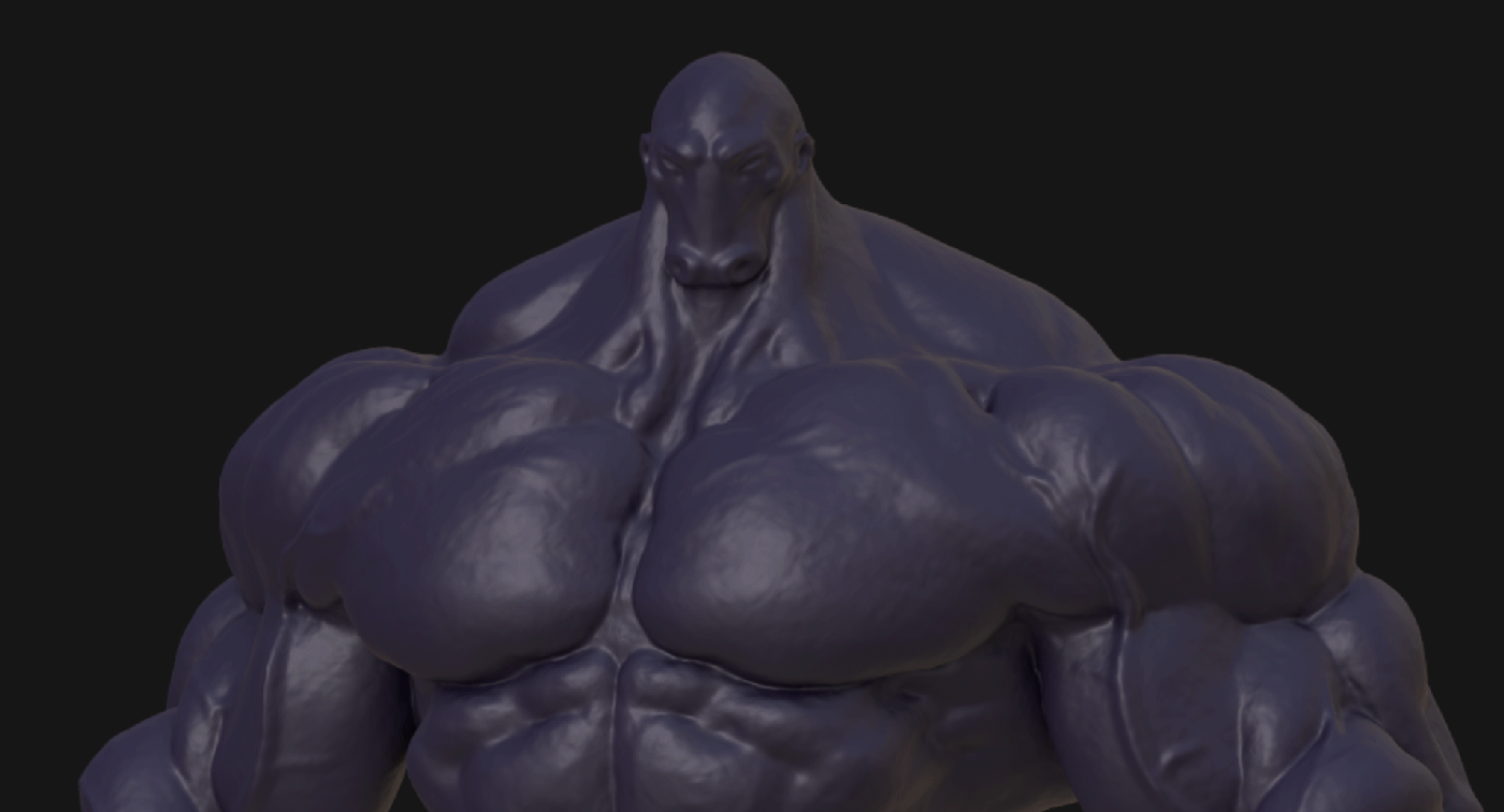
When it comes to hand painted textures, values are everything. They create contrast and define the hierarchy of your colour palette.
In Painter, you can quickly check your values by adding a layer with a filter and using HSL Perceptive to desaturate the texture set. This lets you see how your brightness levels are working independently from colour.
You’ll notice that even the visible brush strokes have clearly defined values. That contrast is what makes the painterly look feel more intentional instead of muddy.
Now let’s build something similar…
STEP 1 – Create three fill layers
Start with three fill layers: A dark base colour, a slightly lighter mid tone and a highlight tone layer.
Add a black mask with a curvature generator to the top highlight layer and target the edges.
For the mid tone layer, use an ambient occlusion generator, so the base layer remains mostly in the contact shadows.
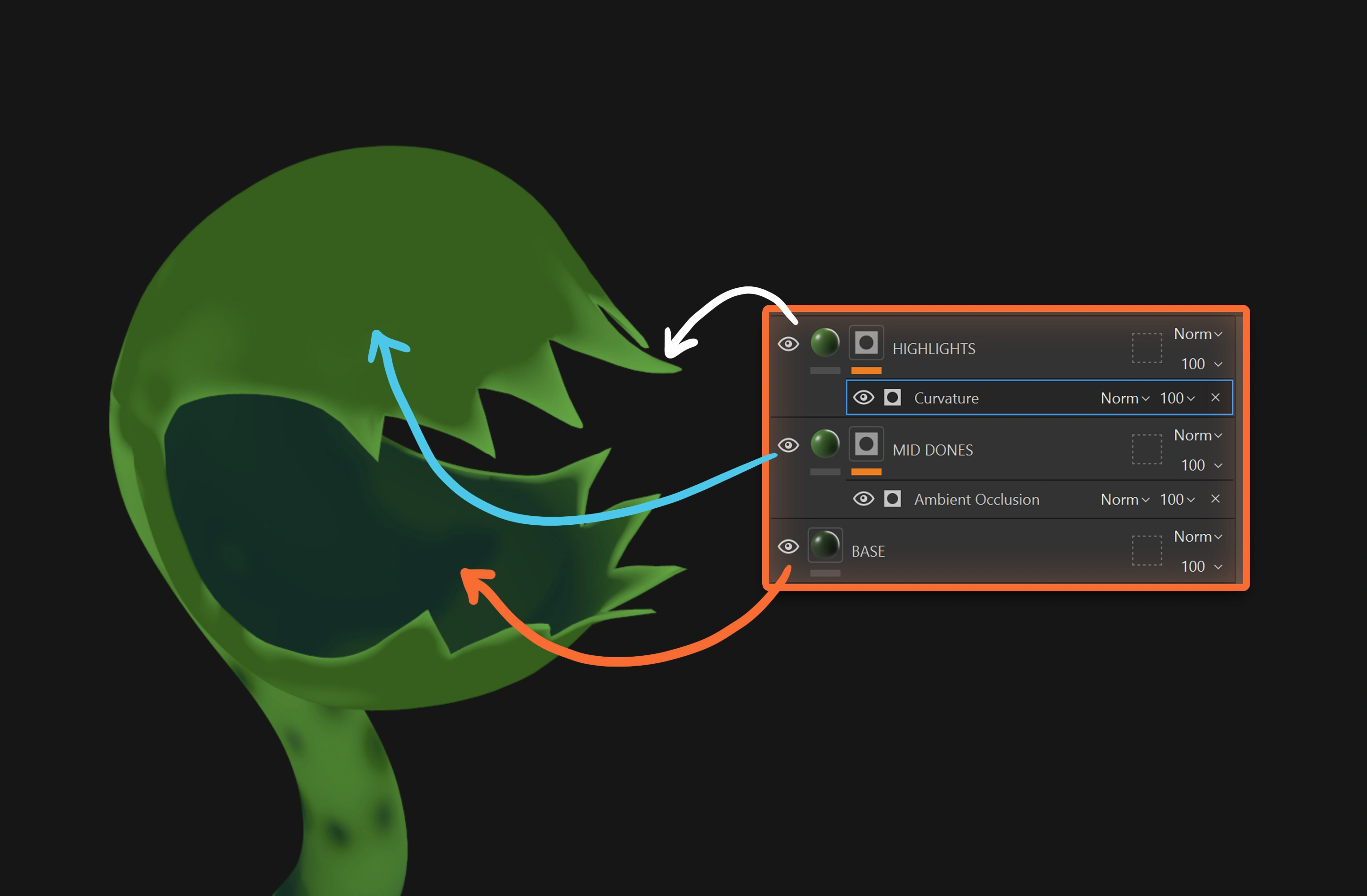
Even without extra shading, this already creates a sense of depth because the colour differences are reacting to the form.
Extra tip: the more saturated your colours are, the more stylised the result will feel.
STEP 2 – Add three paint layers
Now create three separate paint layers: Dark variation layer, Mid variation layer and Light variation.
You could paint everything in one layer, but keeping them separate gives you more control later.
Pablo likes using the brush Knife Painting Heavy to create rough, visible strokes… and by the way, don’t be too precious about it… the rougher the better.

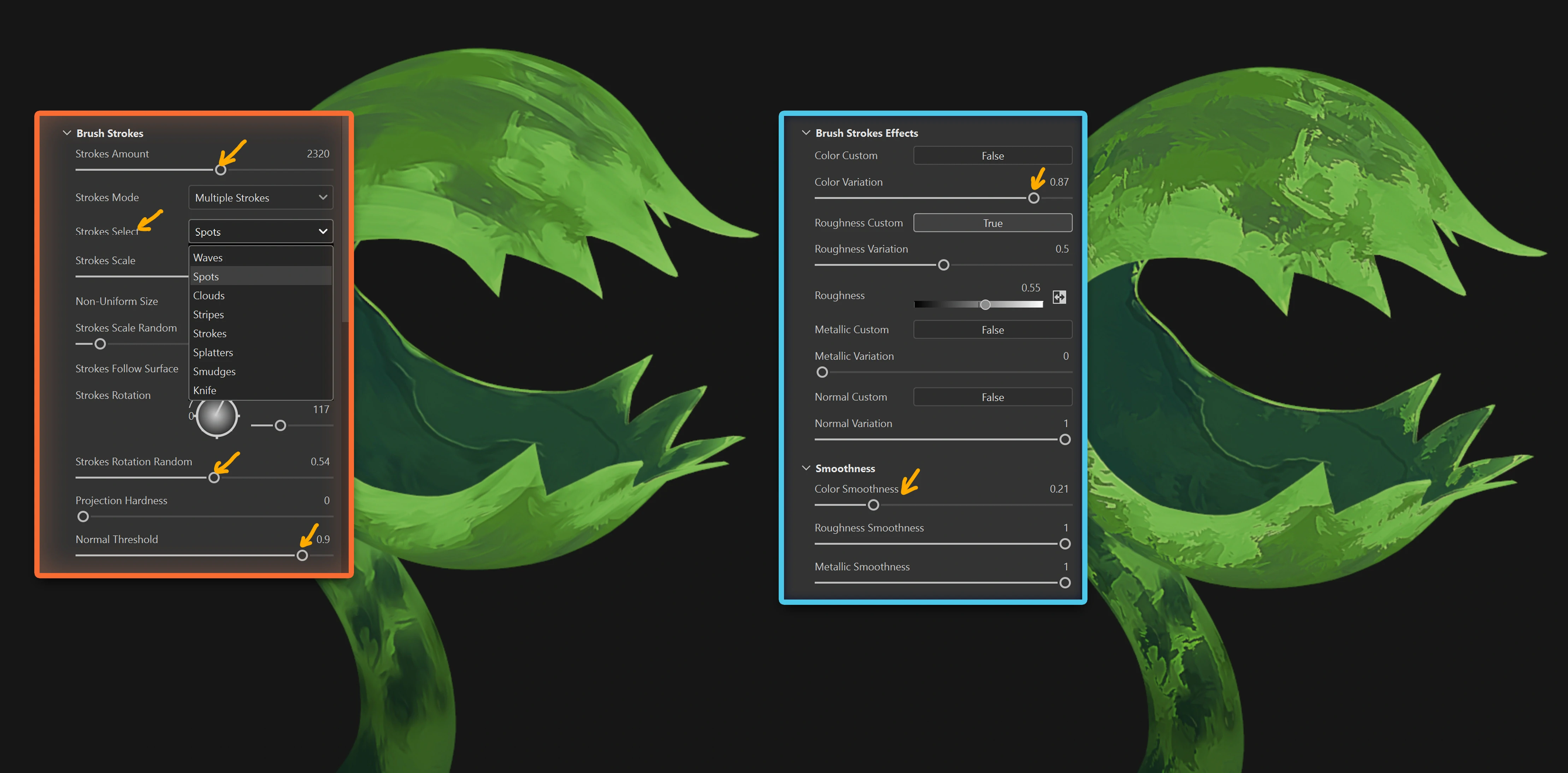
STEP 3 – Add the stylisation filter
This is what really drives the effect.
Create a new paint layer at the top of the stack and set the blending mode to Passthrough so it affects everything below. Then add a filter and choose Stylization from the filter menu.
If you don’t see much happening, tweak the preset or increase the stroke size and quantity.

The stronger your value contrast, the stronger this effect will feel.
Personally, Pablo likes adjusting:
- Brush stroke type
- Stroke rotation
- Stroke quantity
- Colour variation
- Reducing colour smoothness
You can even stack multiple stylization filters and experiment with blending modes.
pretty cool right? and that is not all… you can obviously do way more than 3 layers for more variation and more colours AND more importantly, you can stack multiple stylisation effects and use BLENDING MODES for them!!!
Pablo uses 4 to really push those visible hand painted rough strokes in my version:
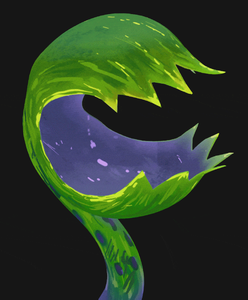
That’s pretty much it.
It’s a simple setup, but the combination of value control, generators, rough strokes, and stacked filters can give you a surprisingly rich stylised look.
Hope you find this useful.


.jpg)

.webp)
.webp)