Start here:
- Start with a clean base.
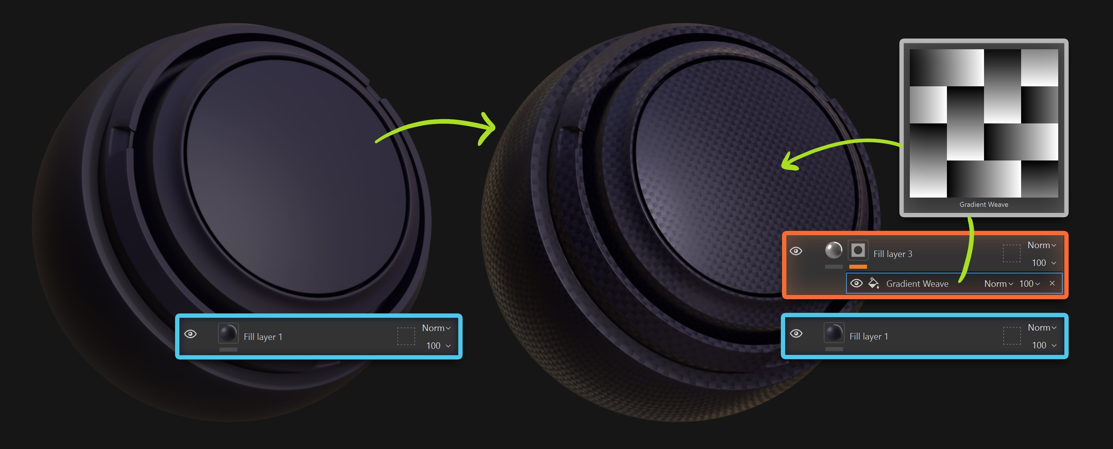
Create a Fill Layer for your base color and roughness.
Keep it simple and slightly matte to start. You can always change it later. - Add a subtle weave pattern
Create a new Fill Layer. Add a black mask and drop in something like “Gradient Weave”.
Keep it soft. This is not “the fabric detail”. It’s just the first breakup layer.
Add a very subtle roughness variation and barely noticeable height. You almost want to question if it’s doing anything…. That’s usually a good sign to not overdo it.
Now we shift it toward “manufactured”.
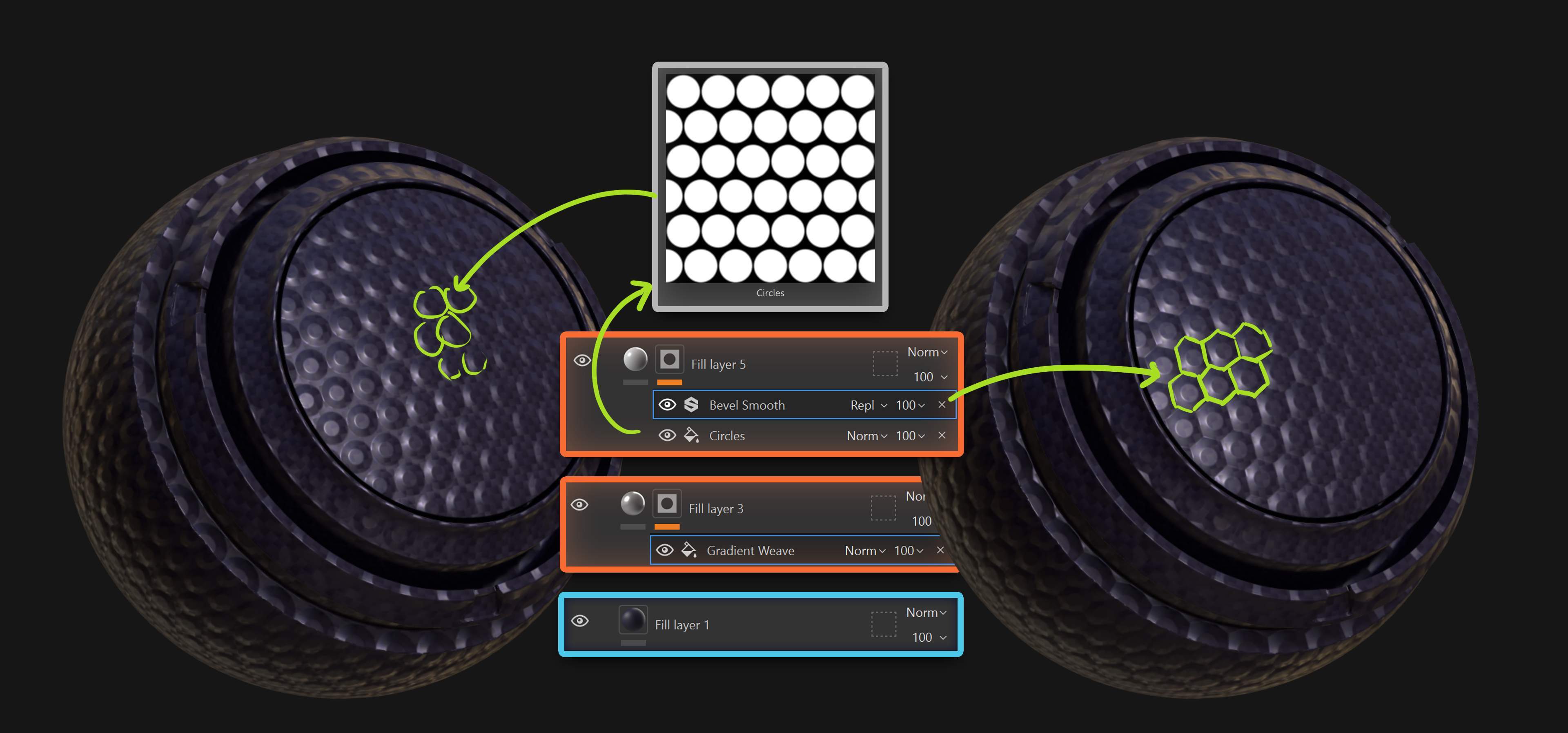
- Add a second geometric pattern
New Fill Layer. Black mask. Add something like “Circles”…. This is where the material starts feeling designed.
- Add a “Bevel Smooth” filter to the mask
That tiny bevel is doing way more than you think. It gives thickness. It gives intention. It stops reading like a flat decal.
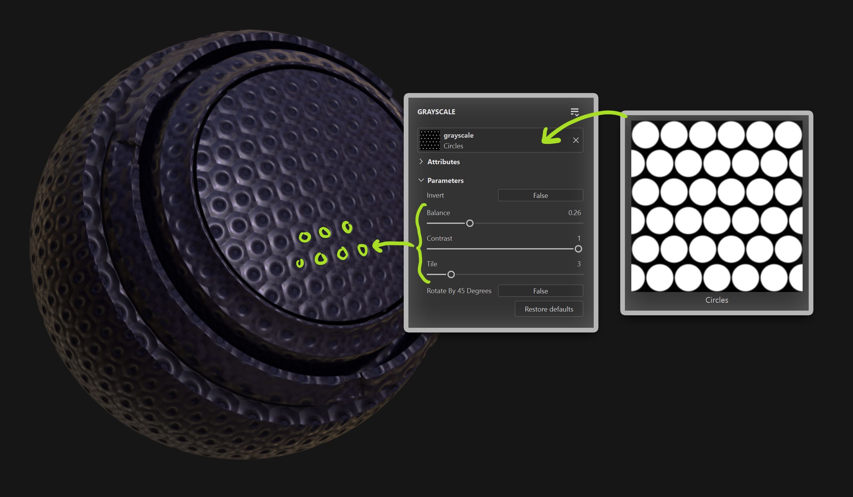
Here’s a trick I use all the time…
Duplicate layer with the circle pattern. Keep the same tiling and repetition.
Then tweak Balance and Contrast so the circles get smaller. Use height to push them inward and suddenly you have a perforated feel… Same pattern. Different read!
Now for the part most people skip…. Even manufactured surfaces aren’t perfect.
Add a subtle Warp filter to distort the pattern just enough so it doesn’t look like a stamped texture.
Tiny imperfections go a long way.
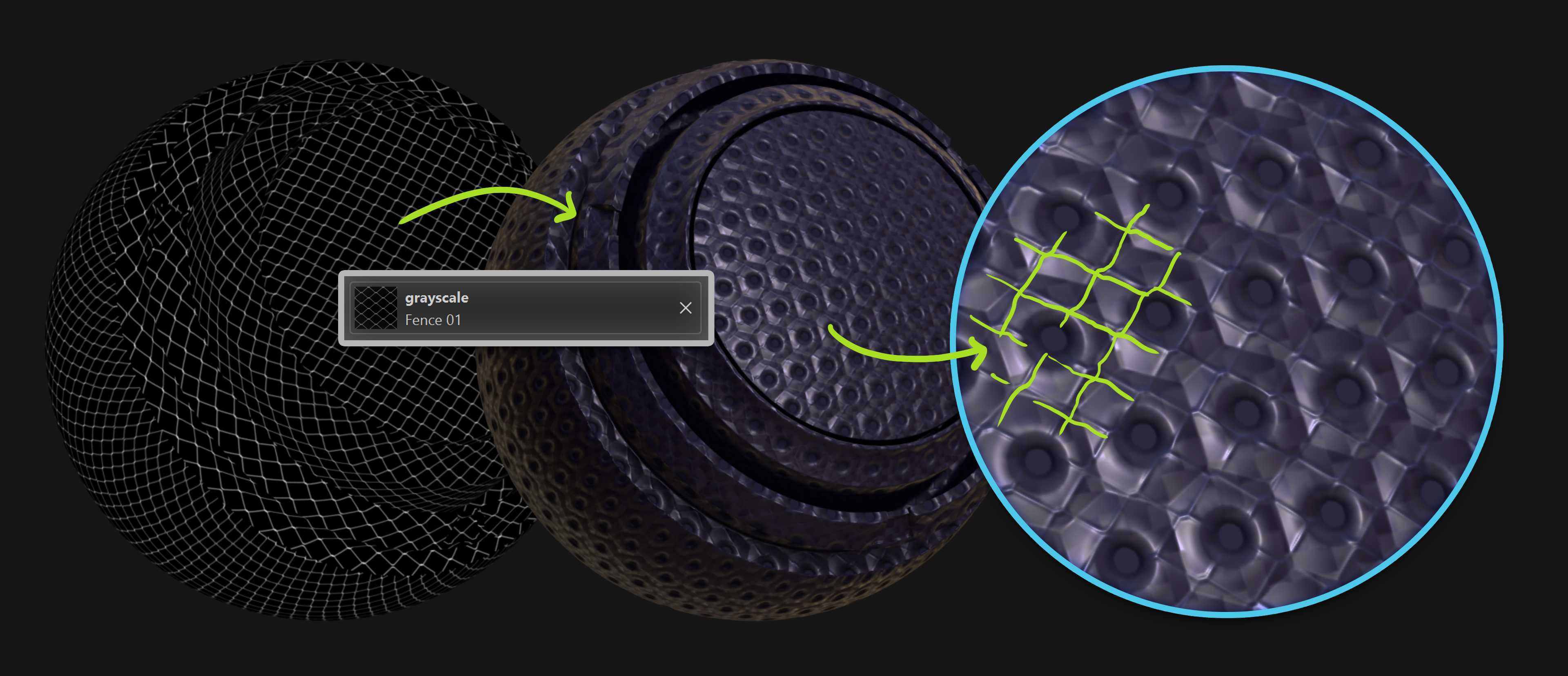
Add another very subtle breakup layer like “Fence 01”. Not to add chaos… but to add structure.
The key is subtlety. If you notice the pattern immediately, it’s probably too strong.
That’s it.
The final material might look complex… but it’s really just variation + controlled height + roughness contrast working together.
Small decisions that compound.


.webp)

.webp)