.jpg)


Use custom inputs to make effects look personal
The simplest way to get more character from built-in filters is to stop using the default procedural noises and feed your effects with custom grayscale images. I often layer a grunge map into a fill and then use a Warp filter whose noise source is a custom input. The result is an effect that feels bespoke to the asset instead of the same repeating procedural pattern.
.jpg)
Here’s how I usually set this up: start by creating a fill layer with a black mask and a base color. Next, drag a grayscale, usually a grunge map into the mask input so it defines where the fill appears. Switch the projection to Tri-planar for smooth, automatic, seamless mapping as you work. Then, add a Warp filter on top. Instead of sticking with the default noise, open the Warp’s Source settings and choose Custom Noise. Finally, drop a grayscale image into that custom noise slot. This makes the warp use your image as its driving field. From there, you can fine-tune the balance, intensity, tiling, and noise parameters to get the exact look you want.
.jpg)
Here’s why this setup works so well: the custom map controls where the distortion happens, so the warping only affects the areas you want, creating more natural and varied results. You can also swap out the input map at any time to instantly test different looks without having to rebuild your masks. By adjusting the balance, intensity, and tiling, you get really fine control over how concentrated or spread out the effect appears. Another fun variation is to add a Blur Slope filter tothe Warp filter and plug in a custom noise there as well. This transforms a plain slope into a textured, almost Voronoi-like soft mask that blends beautifully with your underlying wear and surface details.
.jpg)
Quick tip for blending, you can try blend modes like Overlay, Subtract, or Lighting on the filter layer to integrate the effect with existing channels in different ways. Often, Lighting gives a subtle, integrated look that still respects the material underneath.
Build a single pass-through adjustment layer for color, contrast and sharpness
I keep an "Adjustment" layer at the top of my stack that contains the stack of filters I use to recolor and tweak the final look quickly: Contrast/Luminosity, HSL, Sharpen, and optionally Levels. This is magic when you want to try alternate colors or make one-click global tweaks before exporting.
.jpg)
Here’s how I usually set this up: from the Filters/Effects panel, drag in a Contrast/Luminosity filter—Painter will automatically create a paint layer with that effect already attached. Set the layer’s blending mode to Pass Through so it affects everything underneath, even across groups. If you only want the effect to influence color, Alt+click the Color swatch inside the filter to limit it to the Albedo channel—this helps avoid unintentionally blowing out your roughness or height. After that, add an HSL filter to fine-tune hue and saturation, then throw in a Sharpen filter (start at 0 and increase slowly). I usually sharpen only the color unless I specifically want that crispness in the height or roughness maps. You can also use Levels to quickly target individual channels—Albedo, Roughness, or Height and either punch up or compress those values as needed.
This setup is super efficient because all your final creative tweaks live in one spot. Want to test a darker or desaturated variant? Just lower saturation, bump contrast, or tweak roughness only takes a few seconds. Since it’s non-destructive, you can toggle the entire adjustment layer on and off to compare results instantly.
Once you’ve got your base material and adjustment layer dialed in, group them and turn them into a Smart Material in that way, you’ll have a reusable, editable stack ready for any future project.
And here are a few quick shortcuts I use while prepping smart materials: Shift+Click to select multiple layers, Ctrl+G to group them, and then right-click → Create Smart Material to save the entire setup. Even hidden adjustment layers stay preserved and toggleable when you apply the material later.
Use anchor points as grayscale references to drive targeted adjustments
Anchor points are often shown as a way to reference a mask or map, but I use them as convenient grayscale snapshots of any channel (Albedo, Roughness, Height, etc.) that I can then feed into filters as a mask. This means you can create a complex material, drop an anchor point, and then use that anchor to control where other global adjustments apply.
.jpg)
Here’s how I usually use anchor points in a practical workflow: inside your material folder whether it’s part of a Smart Material or a layered setup, add an Anchor Point at the top. This stores a reference to all the outputs from that folder as grayscale maps. Next, create an external adjustment layer (set to Pass Through) and add a filter, like Contrast/Luminosity. Give that adjustment layer a black mask, then choose Add Fill, and under Grayscale Sources, select Anchor Points and pick the one you just created. In the Fill’s Reference Channel, choose which channel to use, say, Roughness and now that anchor acts as your mask, turning the combined roughness output of your entire folder into a single grayscale map. From there, you can tweak Levels, Contrast, or any other filter settings on that adjustment layer to fine-tune the selected channel across the whole material at once.
This workflow is incredibly powerful because it lets you combine multiple internal roughness, height, or color layers into a single reference map that you can globally edit without digging through dozens of layers. It’s perfect when you need to push or pull detail on one specific channel, like compressing roughness for a glossier look while leaving everything else untouched. Plus, because these anchor-driven edits are stored inside Smart Materials, the same controls carry over wherever you reuse that material, keeping your adjustments consistent and fully editable.
Bonus tip: Change the viewport background color
Someone asked me how to set a plain background color instead of an environment map. It’s easy but not obvious from the display settings.
Go to Edit → Settings → Background Color. There are two swatches (so you can create a gradient if you want). I prefer a neutral dark gray that doesn't distract from the texturing work.
Final notes and workflow reminders
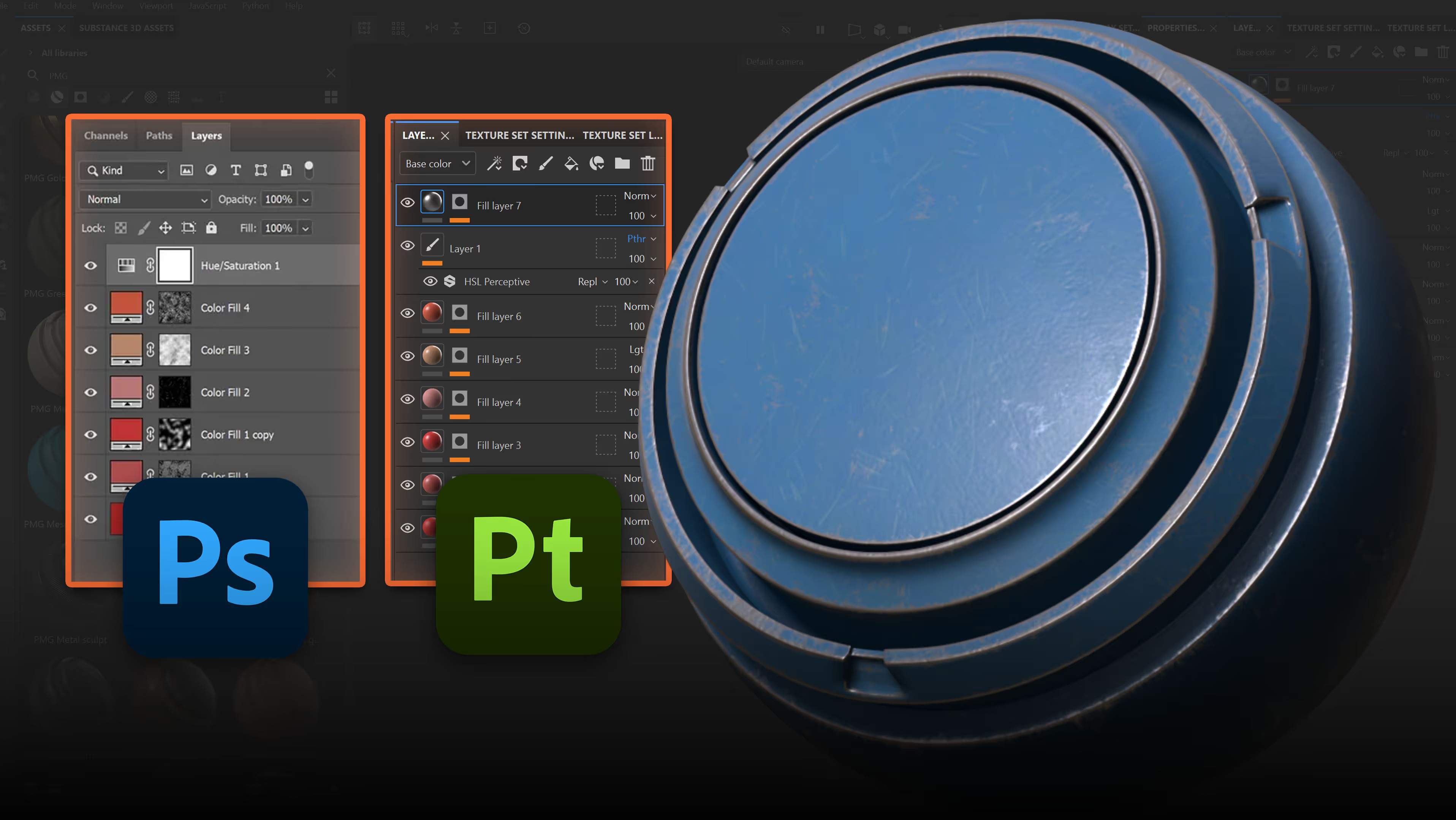
These tips are intermediate-to-advanced tweaks that really boost your control and speed when refining materials. If you’re coming from Photoshop, a lot of these ideas will feel familiar things like adjustment layers and anchors work much like channel comps or alpha references. I actually have a separate comparison guide that helps Photoshop users get comfortable in Painter. It’s worth checking out if you want a quick bridge between the two workflows.

SP101: The Complete Beginner's Guide to Substance 3D Painter!
A clear hands-on and project-based guide to mastering Substance 3D Painter from the ground up.
Check it out


.webp)