


Why screenshots fail and what I’m looking for
I start with a quick example, a sculpt that reads fine inside the app but looks rough when you screenshot it. Jagged edges, visible UI elements, a distracting gradient background, and a shiny red matcap that overemphasizes surface details all make a piece look unfinished, even if the sculpt work is solid. The solution can be condensed into a memorable three-letter acronym: D.F.M. Document, Framing, Material. It's an easy mental checklist I use every time I post a WIP (work-in-progress).
.jpg)
When someone scrolls fast through social feeds, they form an opinion in a split second. A crisp, well-framed image that clearly communicates volume and silhouette will get a like, a comment, or a useful critique. An ugly screenshot gets skipped. I treat presentation as part of the process, not just the final render.
D.F.M.: The three things I check every time
D is for Document, F is for Framing, and M is for Material. Each one is small on its own, but together they add up to a big difference. I’ll go over each with the kinds of tweaks I actually make when I’m preparing screenshots to post.
Document: clean-up resolution and background
If your ZBrush document is the size of your window but you zoom in/out for composition, you’ll end up with pixelated edges in screenshots. The trick he uses is to double the document size and then view it at half, which gives you an anti-aliased, crisp canvas to screen-grab from. I don’t always remember the exact button clicks, but I do remember to create the document sized properly before I capture.
Also, the built-in gradient background ZBrush shows by default can be distracting. I prefer removing or flattening it when I want the sculpt to read clearly and set the document range to zero, and suddenly the background is neutral and unobtrusive. These two little changes remove the first layer of visual noise and make the sculpt read better immediately.
.jpg)
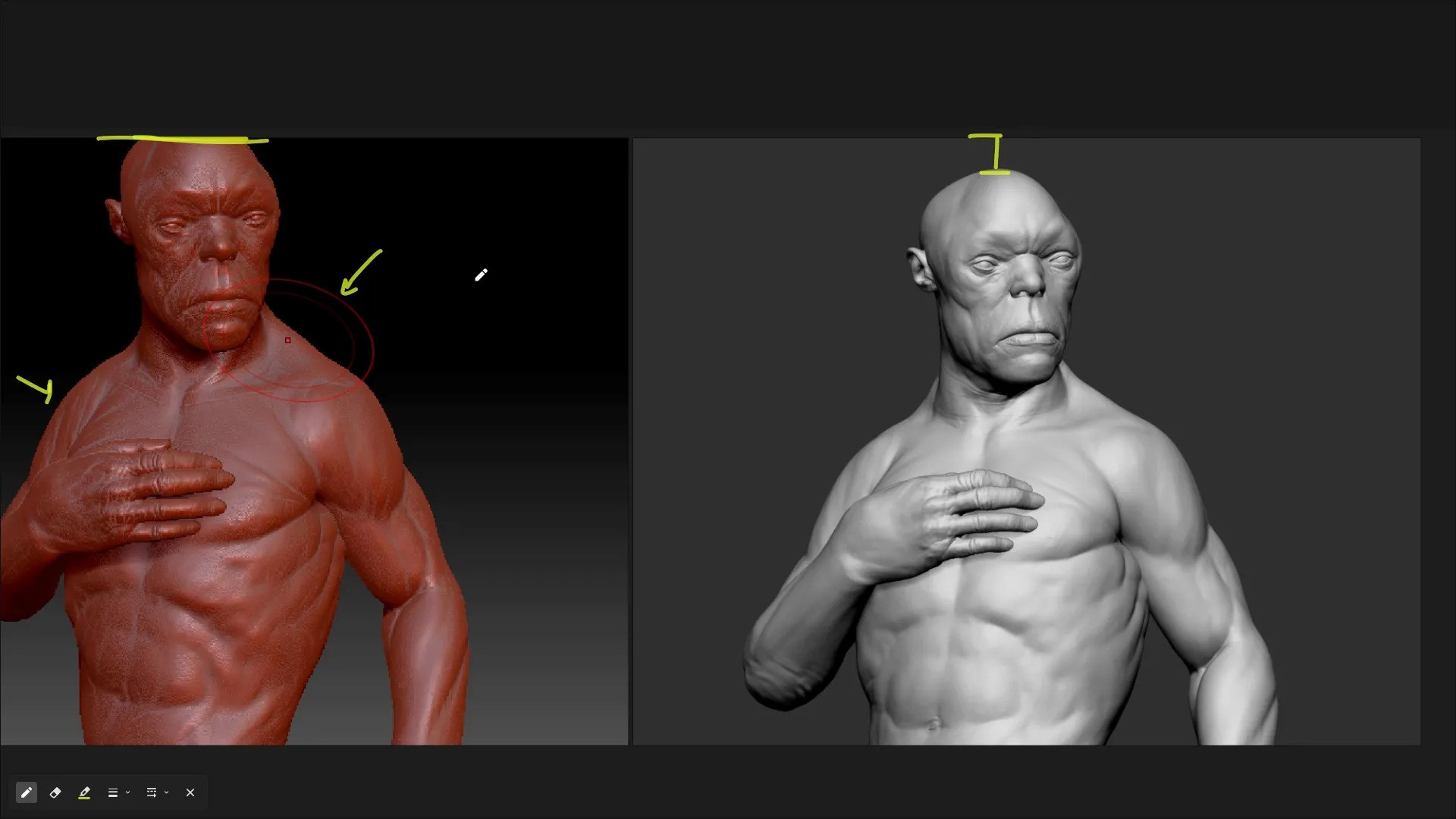
Framing: let the composition breathe
Framing is all about what you include and exclude. This points out two common mistakes: cropping important areas (like heads) too tightly and allowing UI elements or tool cursors to intrude. I try to imagine the viewer’s eye: give the character breathing room, don’t cut the silhouette at awkward points, and remove the UI from the shot.
Material: pick one that tells the truth
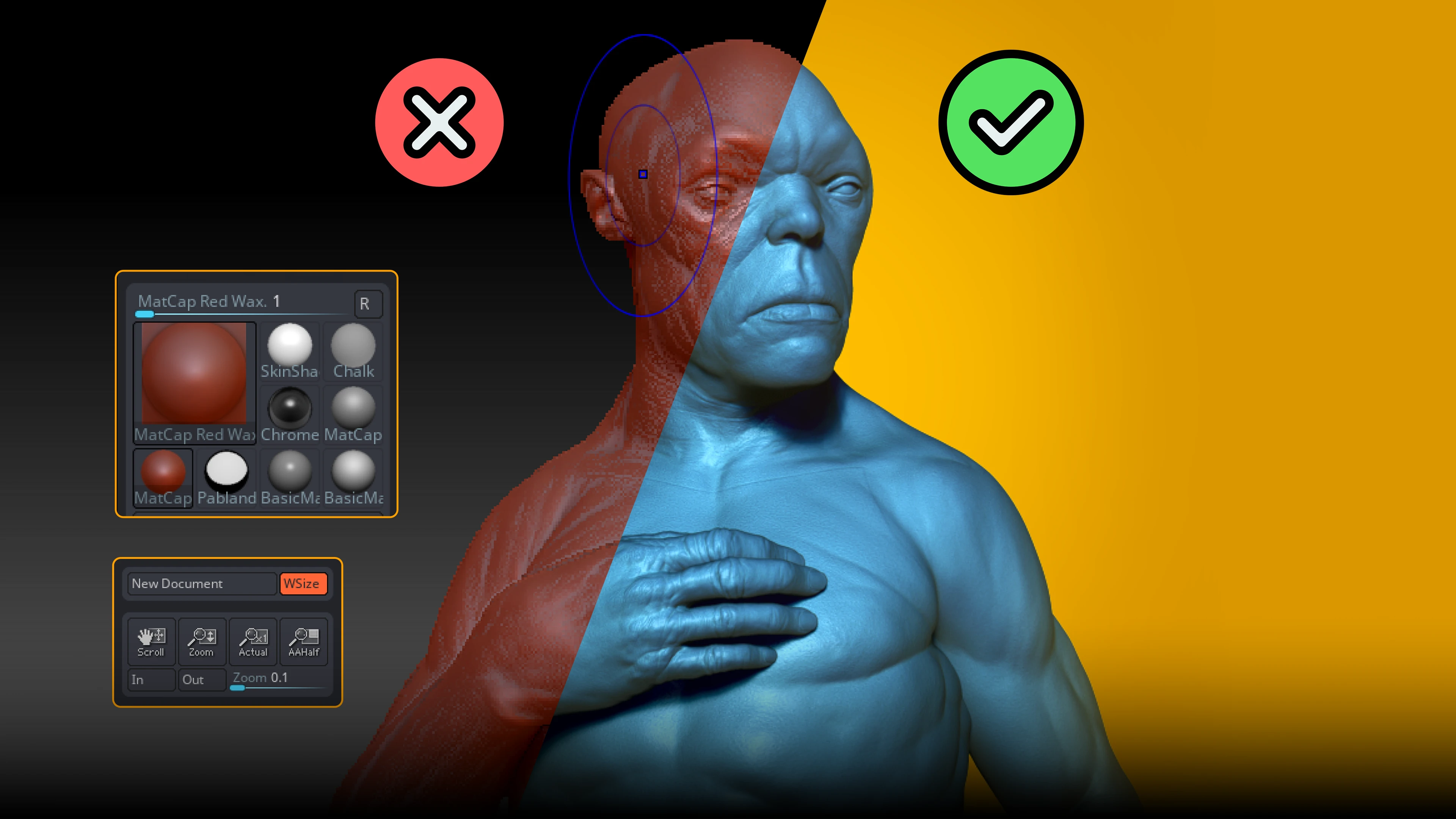
Material selection is something I see a lot of people underestimate. I call out the red wax matcap as a popular but problematic default, since it can exaggerate volumes and crevices that aren’t really there in the sculpt. If I want honest feedback about form and mass, I stick to a material that shows the true shapes, not one that adds drama where it doesn’t belong.
For anatomy and volume work, I usually go with basic gray materials, the plain Basic Material or Basic Material 2, which has a subtle shine that’s really useful for hard-surface edges. In newer ZBrush versions, the Monster Clay Matte materials (green or brown) are also great middle grounds. And if I’m showing polypaint or texture, I pick materials that reveal the polypaint clearly, like Flat Color or skin shaders, instead of ones that fight against it.
.jpg)
When I’m preparing screenshots for posts that I might later texture in Adobe Substance 3D Painter, I pick a material that helps me understand the forms I'll be texturing. For texture-focused images that will flow into Adobe Substance 3D Painter, I pick a shader that doesn’t wash out the polypaint that makes the transition smoother and feedback more actionable.
.jpg)
Two bonus tweaks I use (color & material modifiers)
I like to share a couple of simple extras that are worth keeping in mind. First, background color: pick something that complements the sculpt and your overall visual language, but keep it subtle. I’ll often grab a yellow/orange tone and drop it onto the document background to help the character pop. It’s a quick trick I use when I want a livelier thumbnail for Instagram or ArtStation.
Second, material modifiers: bumping up the diffuse brightens the look, and adjusting specular levels or the specular curve changes how shiny the material feels. Personally, I aim for subtle highlights; too glossy and the sculpt starts looking plastic; too flat and the forms lose definition. The nice thing is you can get a lot of this control right inside ZBrush without ever needing to export to a render app.
.jpg)
Quick layout trick I still use: two-shot collage
I like to take two strategically framed screenshots and drop them into Photoshop. In this case, when you have a character looking in a certain direction, it is best to be mindful of the gaze. If your subject is looking right, the composition’s momentum pushes the viewer’s attention that way. When I create such simple collages or multi-shot posts, I occasionally flip one of the screenshots horizontally to balance the layout again, a tiny change that improves readability, and place them against a shared background color. It only takes a few minutes, and the result is a compact, professional-looking presentation I can post anywhere. I usually do this when I want to show both a close-up and a wider shot together; it communicates intent and progress much better than a single raw viewport grab.
.jpg)
What I actually do, every time.
- I make sure my document size is appropriate for the screenshot
- I flatten or neutralize distracting background gradients so the sculpt reads clearly.
- I frame for breathing room, no cropped heads, and no UI elements.
- I choose a material that clearly shows the sculpted volumes: neutral grays or matte clays for form, skin/flat color for polypaint, and basic material 2 for crisp hard-surface edges.
- I nudge the material diffuse/specular if needed to control brightness and highlights without leaving ZBrush.
- When I want a thumbnail, I make a simple two-shot layout and add a background color to make it pop.
These aren’t big, heroic moves. They’re small, repeatable choices that add up to a professional-looking WIP in minutes. They also translate when you later bring your sculpt into Adobe Substance 3D Painter because clean presentation helps you spot proportion or sculpting problems before you spend time texturing and baking.
.jpg)
Free resources and continuing the workflow
I also like to share some free presentation materials you can download and try. These presets cover different sculpting and hard-surface looks, and they’re great for experimentation. When I want to present my sculpts with different tonalities, I start with these: a clay material, a copper-like hard-surface matcap, and even comic-style mats for stylized designs.
.jpg)
Final thoughts on why this matters.
I keep coming back to one sentence from the video: you might be sculpting something really awesome, but if the presentation is terrible, no one's going to notice. That’s blunt and true. Presentation is not just about presenting; it is communication. When aiming to judge your work before moving onto the next workflow stage, or when asking for critique, you want the viewer to focus on the right things: silhouette, volume, and intended detail. The D.F.M. (Document, Framing, Material) method gives you a reliable framework for that.
Try it and share the results. I’m curious to see how a cleaner screenshot changes the feedback you get.

How to present your 3D characters in a simple and effective way
In this video, I'll show you how to present your 3D characters effectively, even if they're unfinished, using ZBrush and Blender. Learn practical tips for lighting, materials, and contrast to create professional-looking renders
Check it out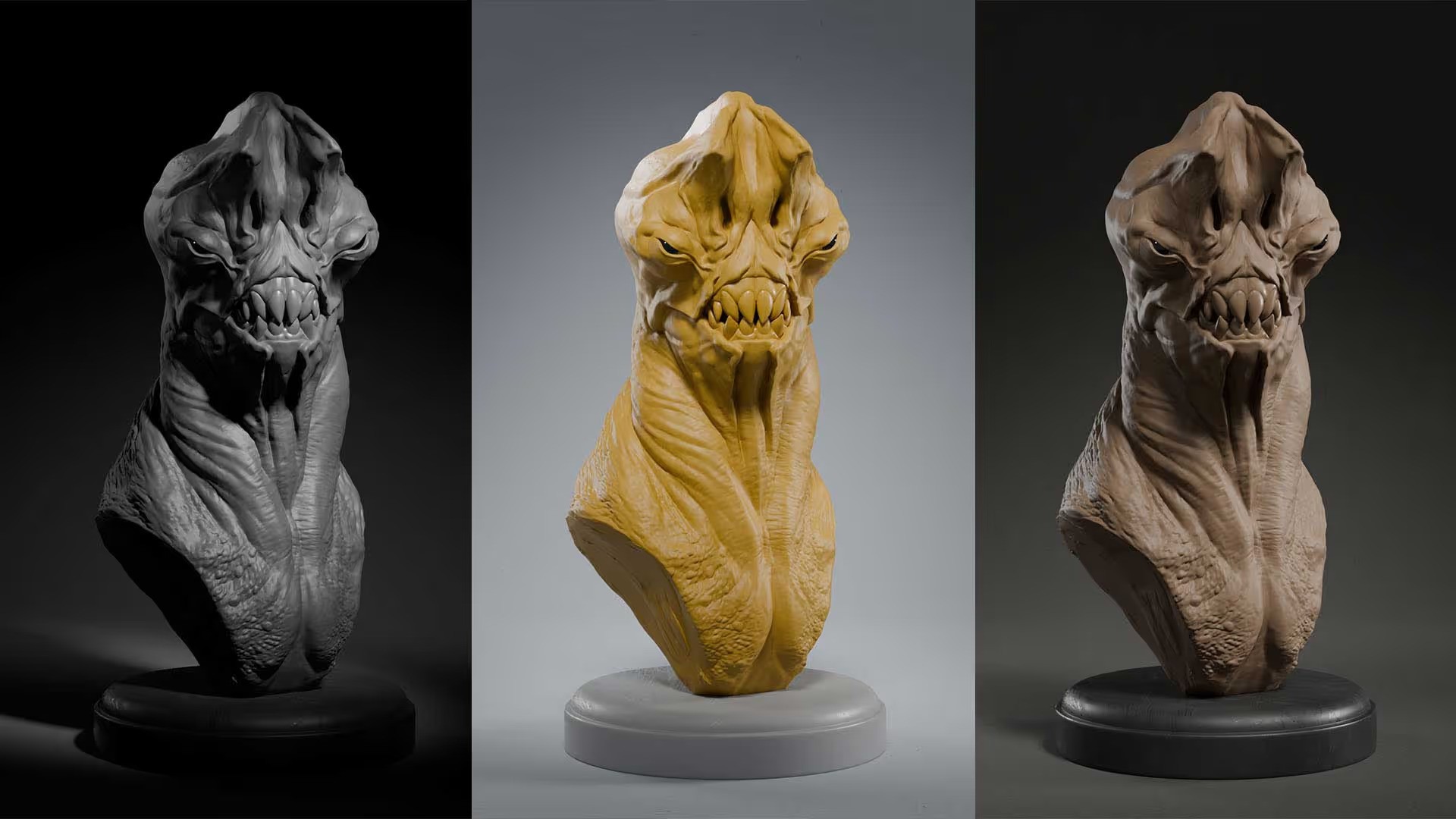


.webp)