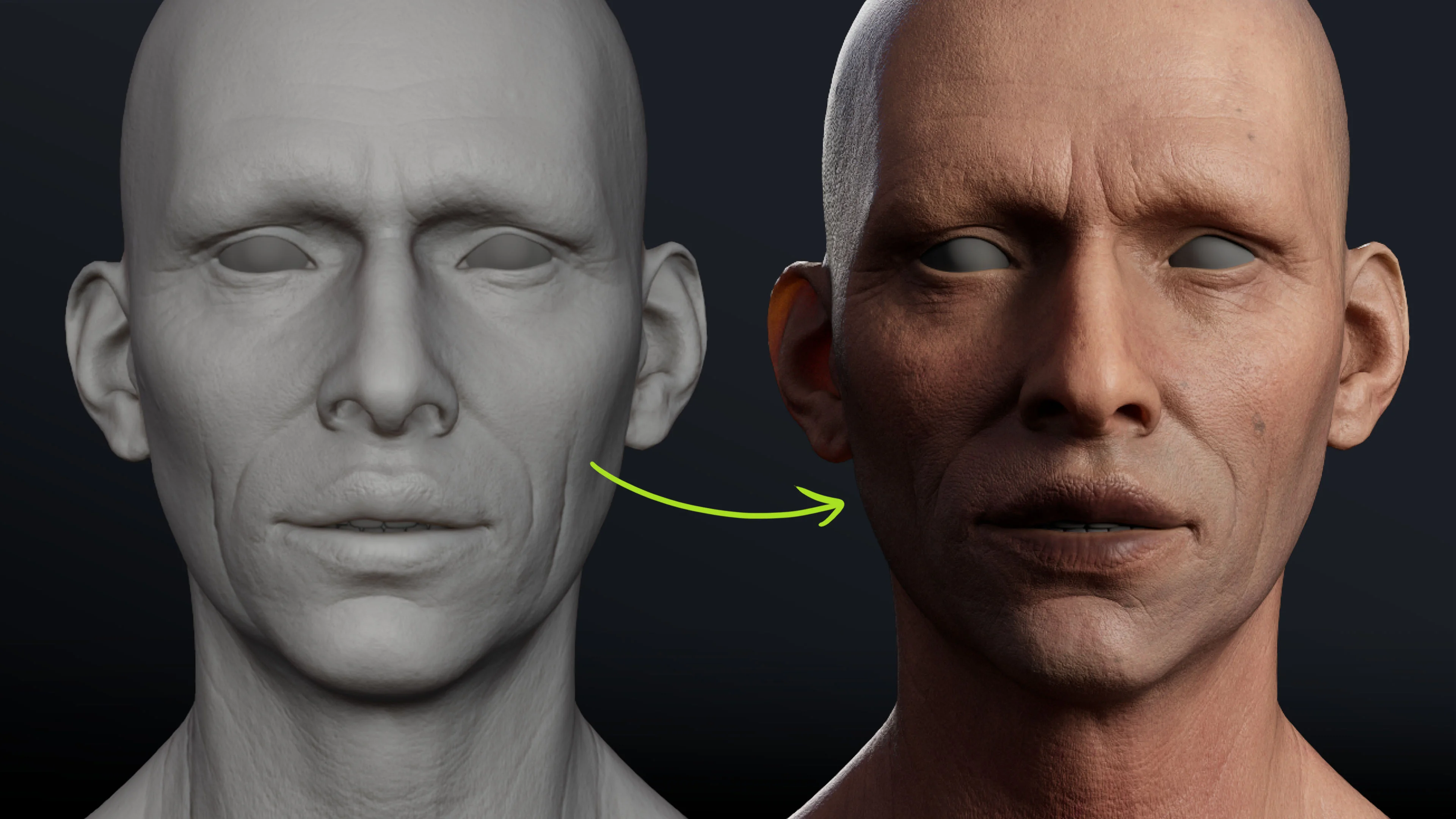




In this tutorial, I’ll walk you through a hand-painted skin workflow in Substance 3D Painter using four main passes: zones, integration, definition and details. We’ll combine painted masks with procedural textures and baked mesh maps, keeping everything non-destructive so you can come back and adjust it.
The focus is the base colour, or albedo, with a simple roughness setup to make the surface easier to judge. This isn’t a full skin-shader or lighting tutorial. The goal is to build a rich colour texture that you can take into a renderer such as Marmoset and continue refining.
What you’ll need:
- Substance 3D Painter.
- A UV-mapped head mesh with mesh maps already baked.
- A normal map carrying the sculpted pores, wrinkles and other surface details.
- Curvature, ambient occlusion and position maps for the mask-building techniques below.
Step 1: Organise the skin into four main folders
Before adding colour, give each part of the process a clear job. I use four folders, built from the bottom of the stack upwards:
- Zones: broad red, yellow and blue regions that establish underlying colour variation.
- Integration: skin-tone layers that bring those strong colours together. I also think of this as the epidermis pass.
- Definition: darker lips, reddish eye areas, lighter patches and other variations that make the face feel less generic.
- Details: fine crevice colour, blemishes, moles, freckles and small vessels.
These aren’t four individual paint layers. Each folder can contain several fill layers, masks and effects. The organisation simply makes it easier to see what each pass contributes.
Here’s the key: complex skin comes from the combined effect of simple, subtle layers. You don’t need one complicated mask that does everything. You need several manageable effects that work together.
Step 2: Check the baked maps and separate roughness from colour
The pores and wrinkles in this example already exist in the sculpt and come through the bake. The high-resolution ZBrush head was around 50 million polygons before being decimated for baking onto the low-resolution mesh. You don’t need that exact polygon count, but you do need enough useful sculpted information to support the texture.
Inspect the curvature map first. It should contain the small folds, pores and crevices you want to use later. A detailed curvature map gives you much finer control than a map containing only the large facial forms.
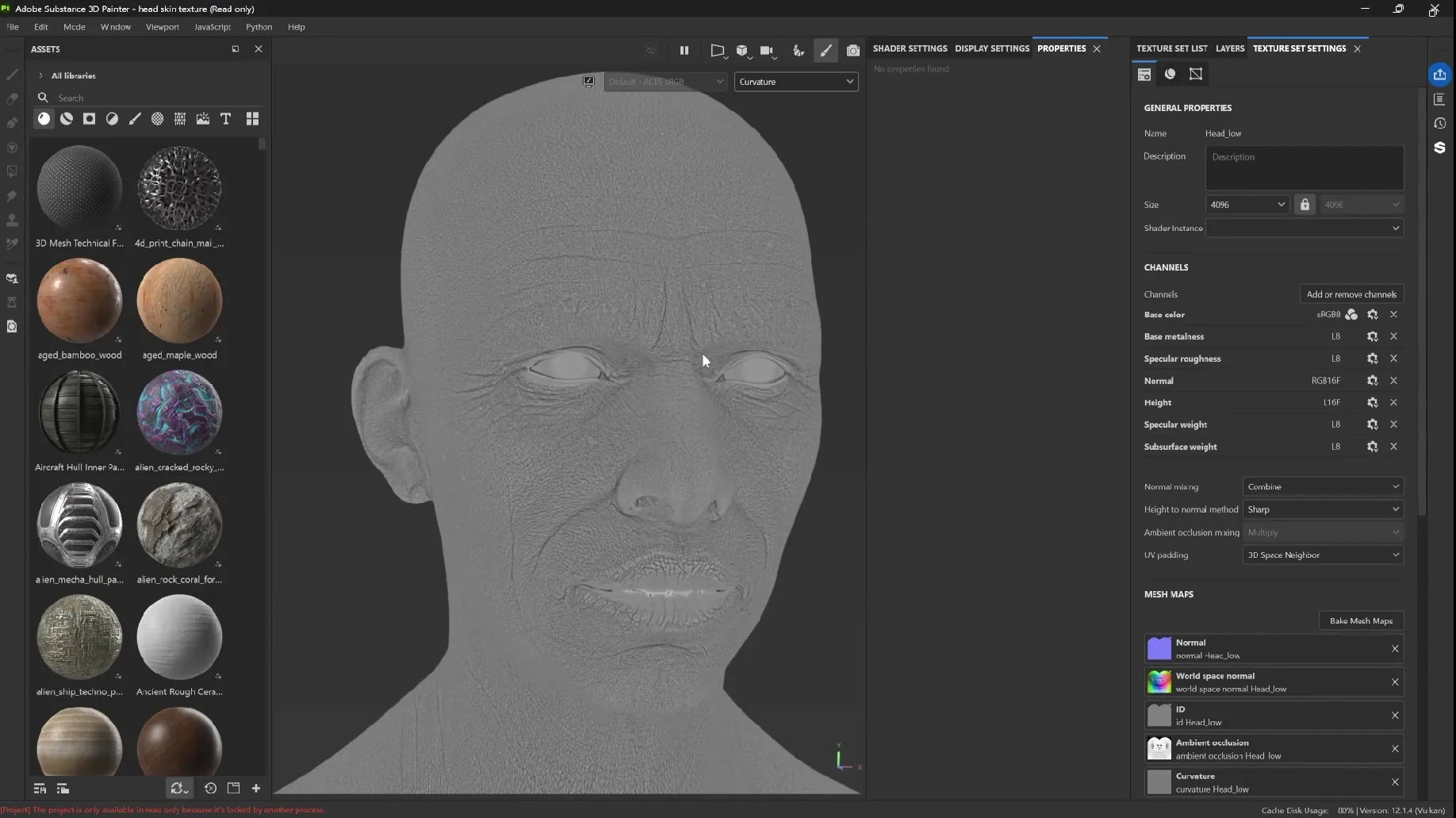
Ambient occlusion is useful for isolating recessed areas, while position helps create broad top-to-bottom transitions. Thickness can also be helpful when refining skin, although curvature does much of the detailed work here.
Add a separate base fill layer underneath your colour work and use it to establish a moderately rough surface. Keep the colour layers above it restricted to Base Color, so they don’t accidentally overwrite roughness, height or other channels.
Depending on the shader and Painter version, the roughness control may be labelled Roughness or Specular Roughness. The example uses OpenPBR; older projects may use ASM Metal Rough. Don’t let the naming difference distract you from the colour workflow.
Step 3: Paint the red, yellow and blue face zones
Create three colour-only fill layers named R, Y and B. Give them strong red, yellow and blue colours. Leave red as the underlying colour, then use black masks to control where yellow and blue appear.
At this stage, the face is going to look a bit like a clown. That’s fine… these are underlying hues, not the final skin colour.
Use anatomy as a placement guide
A common face-zone approach divides the face into yellow across the forehead, red through the middle and blue across the lower face. I prefer to adapt that idea to the forms of the particular character:
- Red: keep warmth through areas such as the cheeks, nose and ears.
- Yellow: target forms where bone feels close to the surface, such as the skull, bridge of the nose, parts of the cheekbones, chin, jawline and clavicles.
- Blue: target cooler, hollow-feeling areas around the eyes, mouth and selected parts of the neck.
Think of this as a painting guide rather than a rigid anatomical map. The character’s structure should influence where you place the colours. Fat deposits are another consideration when deciding where warmer yellow variation might be useful.
Build the yellow mask
- Add a Black Mask to the yellow fill layer.
- Add a Paint effect inside the mask.
- Enable symmetry for the broad pass.
- Choose an irregular brush such as Dirt 1.
- Paint white over the skull and other selected bony forms.
Press X to switch between white and black. White reveals the yellow; black removes it. Work back and forth instead of trying to get the perfect coverage in one stroke.
Keep the chin and jaw treatment lighter than the skull. You want some yellow influence, not a solid yellow outline around every bony feature.
Add the blue zones
Repeat the same black-mask-and-paint setup on the blue layer. Reveal blue around the eye sockets and mouth region, then extend it into selected hollow-feeling areas.
If you paint too lightly over red, you’ll get purple rather than a clearly established blue zone. It’s okay to push the colour initially. You’ll soften it in the integration pass.
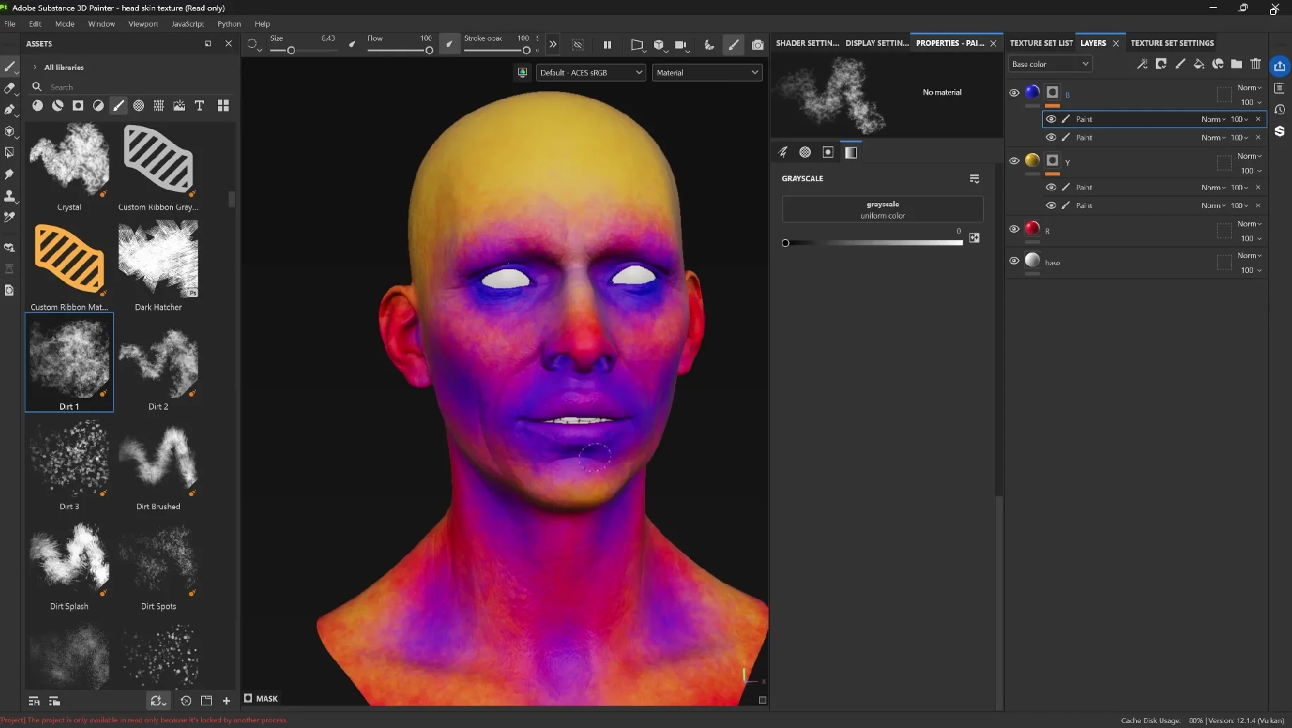
For extra control, add a second Paint effect to the yellow and blue masks. Use this to soften transitions, extend coverage gently or reduce blue on the lips without disturbing the first pass.
Once the placement feels useful, group these layers into a folder named Zones.
Step 4: Integrate the zones with three skin-tone layers
Now we can bring the exaggerated colours back towards skin. Create three colour-only fill layers above the Zones folder:
- B1: a middle skin tone.
- B2: a slightly darker, redder variation.
- B3: a slightly lighter, more yellow variation.
Keep these differences relatively small. The purpose is to generate variation, not introduce another set of strong colour zones.
Add a black mask and a Paint effect to B1. With the Dirt brush, gradually reveal the skin tone across the head. Use light pressure and avoid completely covering every area with the same value.
The underlying red, yellow and blue should still influence the result. That’s why the zone pass is useful: it gives you variation that would be much harder to place individually once the face is already a uniform skin colour.
Try a procedural starting point for B2
You can paint all three masks manually, but a procedural texture is a useful alternative:
- Add a black mask to B2.
- Add a Fill effect inside the mask.
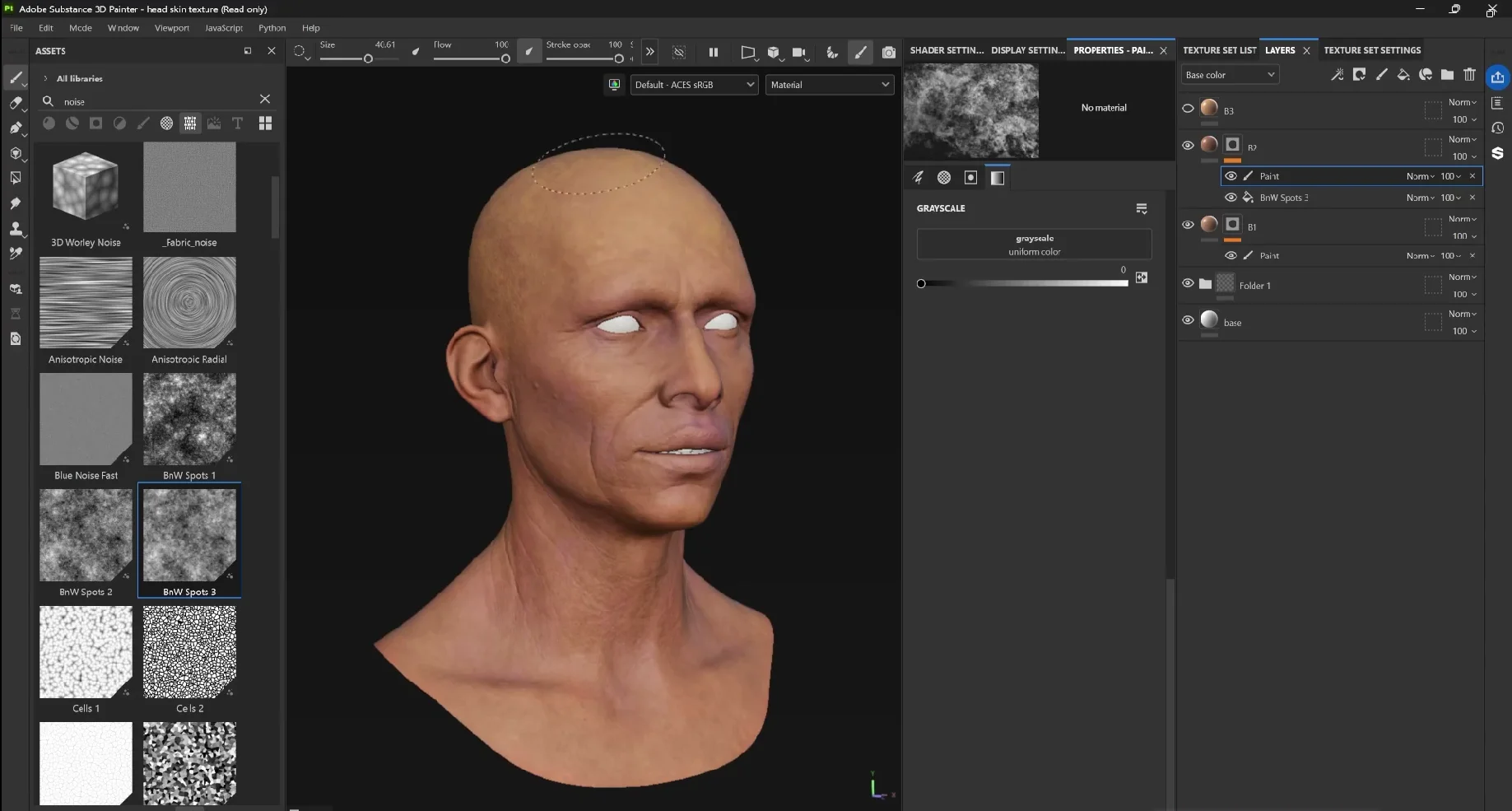
- Choose a noisy texture such as BnW Spots 3.
- Adjust tiling and balance until the break-up feels appropriate.
- Add a Paint effect above the procedural fill to refine it.
Paint black where the darker tone shouldn’t appear, and white where you want more of it. This combination is very effective: the procedural texture gives you a quick starting point, and the painted correction gives you control over placement.
Alt-click a mask to inspect it directly. You’re looking for irregular coverage with a range of grey values, not just hard black-and-white islands.
Step 5: Build a controlled lighter-skin mask
For B3, use the baked maps to establish a broader distribution before painting corrections.
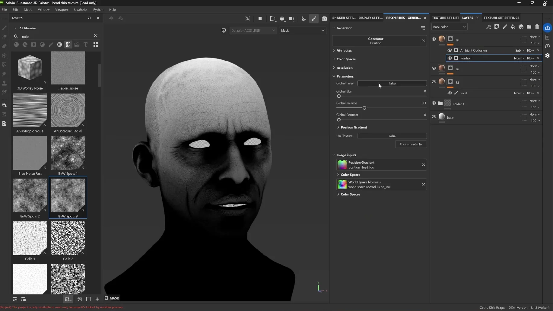
- Add a black mask and a Position generator.
- Adjust its balance so the lighter tone is concentrated towards the top and fades down. A balance around 0.2–0.3 is a starting point in this example.
- Add an Ambient Occlusion generator above it.
- Invert the AO output so the recessed regions you want to exclude become white.
- Set that AO effect’s blending mode to Subtract.
- Add Levels to refine the mask contrast.
- Finish with a Paint effect for local corrections.
The Position generator establishes the broad gradient. The inverted AO subtracts selected recessed areas from it, helping keep the lighter colour out of places such as the eye region.
Check the material again and correct anything that feels too automatic. Remove lighter colour where it creeps too far into the eyes, or add some further down the neck if the gradient feels too restrictive.
This is the general pattern for the rest of the tutorial: generate a useful distribution, then paint it into the character.
Step 6: Add optional colour break-up and preserve blending modes
The three integration layers are enough to continue, but you can add another subtle variation if the surface needs it.
Create a fill layer with a lighter yellowish colour and try Screen or Overlay. Screen lightens the result; Overlay adds contrast and can make the colours feel more saturated.
Mask the layer with an irregular texture, such as a crystal-like pattern, then adjust its tiling and balance. If the source pattern is too obvious, add a Blur filter. Reduce the layer opacity until it becomes a small contribution rather than a visible pattern.
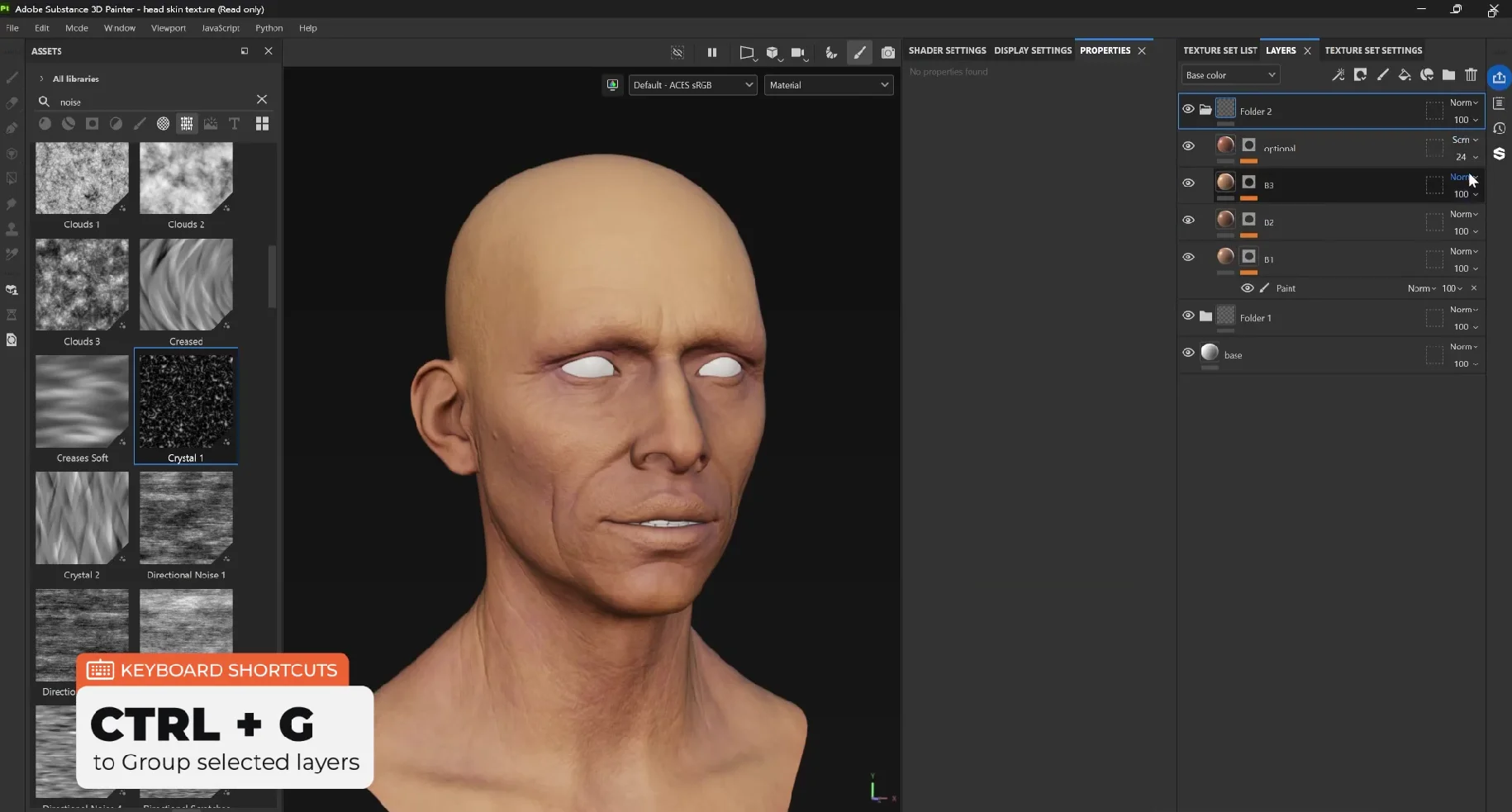
Group the integration layers with Ctrl + G and name the folder Integration.
Important: if a layer uses Screen, Overlay or another blending mode that needs to interact with the layers below the folder, set the folder’s Base Color blending mode to Pass Through. Otherwise, grouping can change the appearance of the skin.
Do this for later folders too whenever their internal blending modes need to affect the underlying stack.
Step 7: Define the lips, eyes and facial folds
At this point, you should have a reasonable skin base, but the face may still feel generic. A targeted darker pass makes a surprisingly big difference.
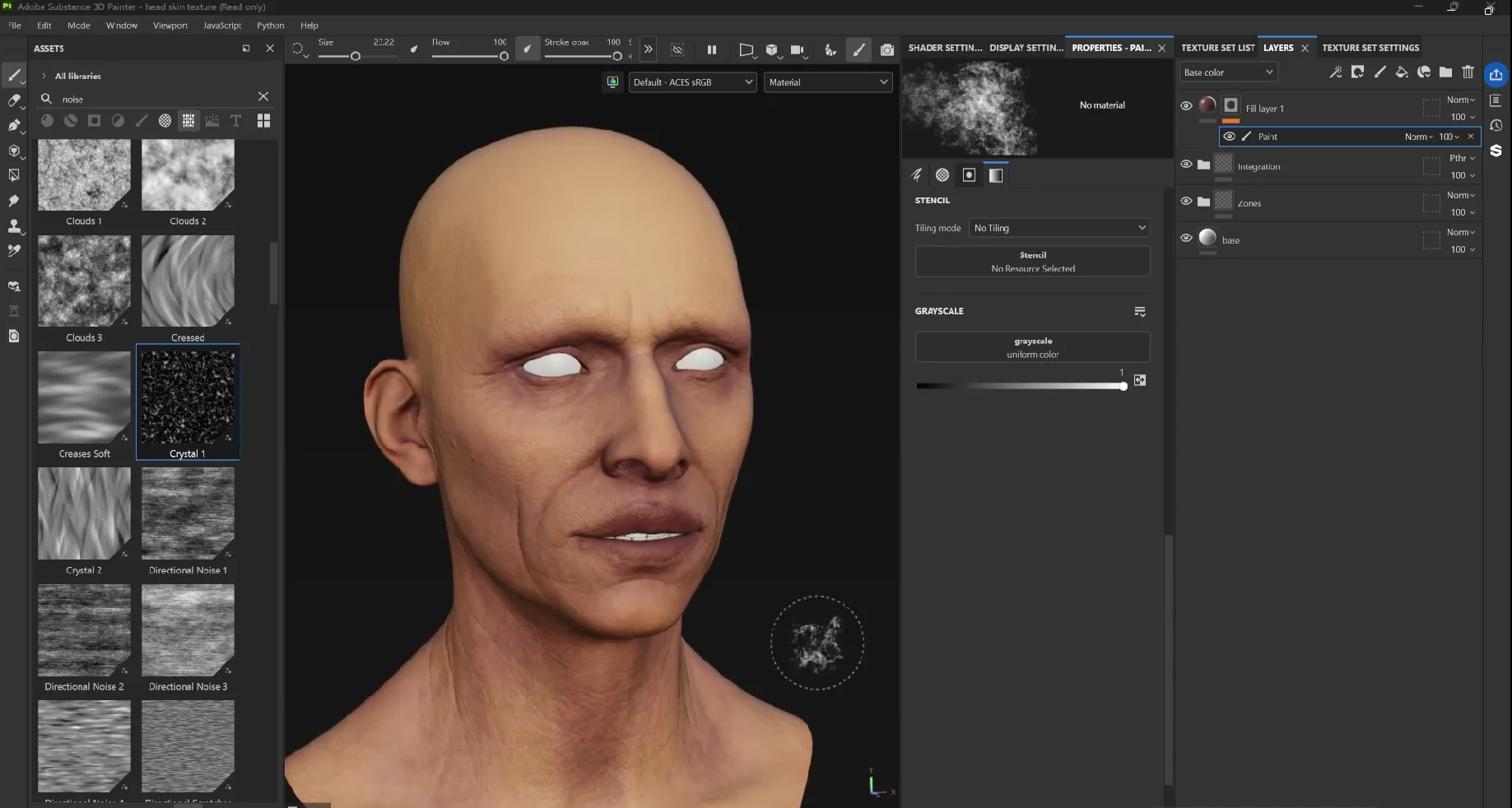
Create a colour-only fill layer with a dark, muted red. Add a black mask and a Paint effect, then reduce your brush size.
Reveal the colour selectively around:
- The lips.
- The nostrils.
- Selected parts of the nasolabial folds.
- The eye area.
- Other areas that need a little more warmth or darker definition.
I often paint an effect a bit too strongly and then switch to black to pull it back. It’s a simple way to judge the placement before worrying about the final intensity.
Check both sides of the face, even with symmetry enabled. An asymmetrical sculpt can leave one side with slightly different coverage.
The advantage of a fill layer is that the colour stays editable. If the lips feel too purple or too dark later, change the fill colour or opacity without repainting the mask.
Step 8: Create organic mottling with layered masks
Now let’s build a more complex mask from very simple ingredients. This adds irregular colour variation while still responding to the sculpted forms.
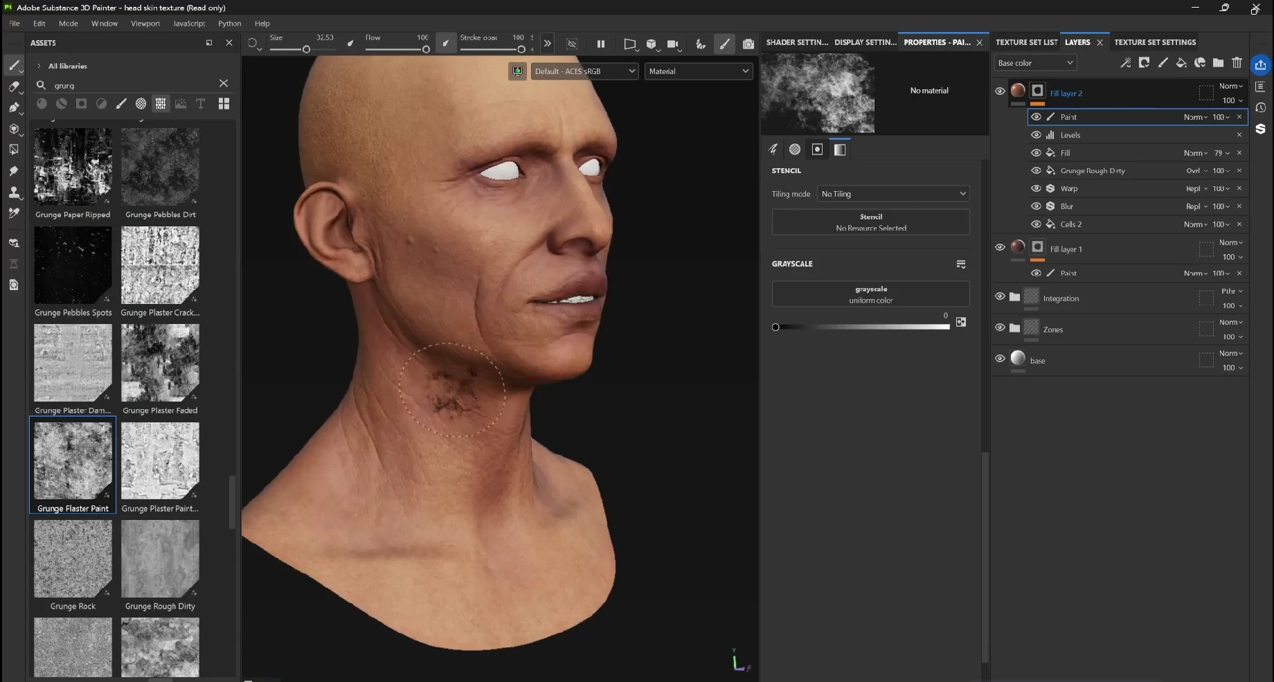
Create another fill layer with a black mask, then build this mask stack from the bottom upwards:
- Cells 2: increase tiling to make the cells smaller.
- Blur: soften the recognisable cell structure.
- Warp: use a restrained intensity to distort the regular pattern.
- Organic grunge: add it as another Fill effect and set it to Overlay to introduce local contrast.
- Baked curvature: add the mesh map as a Fill effect, keep it on Normal and reduce its opacity so it only partly influences the result.
- Levels: tighten the values to reveal the useful break-up.
- Paint: remove unwanted coverage and refine the placement.
Choose grunges carefully. A texture full of straight scratches can still look like scratches after blending. Start with something that already has a more organic character.
The curvature contribution helps the mask relate to folds and crevices instead of floating randomly over the head. The procedural layers keep that relationship from becoming too uniform.
For the colour, sample an existing skin tone and move it towards a slightly darker red. Hold Shift while using the colour picker to sample the underlying base colour rather than the shaded appearance.
Finally, paint away distracting orange or red patches. Keep some areas, such as parts of the upper head, relatively clean.
Step 9: Layer different brushes for broader variation
One brush repeated everywhere can become recognisable. A useful way to avoid that is to combine several Paint effects inside one mask, each with its own opacity.
Create a new fill layer and temporarily give it a bright yellow colour. This is just a visual aid so you can clearly see the mask you’re building.
- With a large Cement brush, paint scattered clusters across the head. Lower that Paint effect’s opacity.
- Add another Paint effect and use Dots Erased for a different scale of break-up. Keep the coverage sparse and reduce its opacity too.
- Add a third Paint effect with the Bark brush for larger organic variation.
For Bark, turn Follow Path on in the brush orientation settings. Instead of stamping the same fixed direction, the brush follows your stroke and becomes much more useful for organic marks.
Once the mask works, replace the diagnostic yellow with a suitable colour. Try Overlay, then adjust the colour and opacity together. A redder tone can reinforce warm mottling; a cooler tone can darken the result differently.
Use C to cycle to Base Color and judge the colour without material shading. Press M to return to Material view.
Add a gentle lighter pass if needed
You can also create a blurred AO-driven mask for a lighter colour variation. Use a desaturated yellowish tone with Screen, then paint away coverage from the lips and other areas that shouldn’t become pale.
Reduce the intensity substantially. If it weakens an earlier feature, adjust the mask or reorder the relevant layer so the feature remains readable.
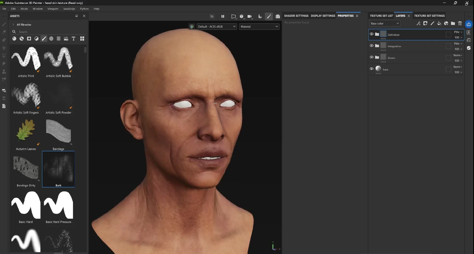
Group these facial colour passes into Definition and set the folder to Pass Through where needed.
Step 10: Use curvature to colour pores and wrinkles
The fine surface details already exist in the normal map. Now we’re adding a little colour to them so they feel more integrated into the skin.
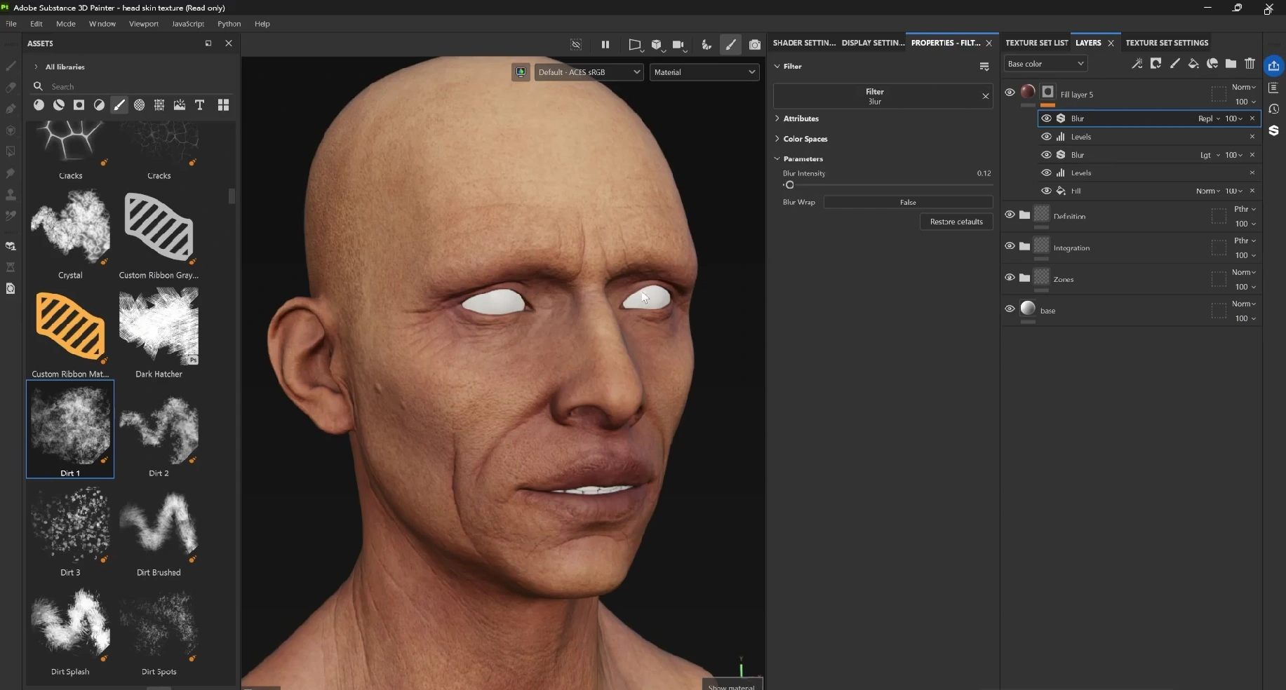
Create a new fill layer with a black mask. Add the baked curvature map as a Fill effect, then add Levels.
- Invert the curvature so the recessed details become the areas revealed by the mask.
- Increase contrast to isolate the fine lines and crevices.
- Use a temporary bright colour to check exactly what the mask targets.
If increasing contrast makes the fine details disappear, try this:
- Add a Blur filter.
- Set the Blur effect’s blending mode to Lighten.
- Add another Levels effect above it.
This preserves the original mask while allowing a softened contribution around it. You can then adjust the combined result rather than crushing the original fine lines further.
Replace the diagnostic colour with a restrained reddish skin tone. If the result looks too sharply drawn, add another small blur. The goal is a subtle colour change in the pores and wrinkles, not a dark outline around every sculpted detail.
Step 11: Add small blemishes and broader redness
Use separate layers for small spots and larger colour clouds. Keeping them independent makes it much easier to balance the texture.
Build the small-spot mask
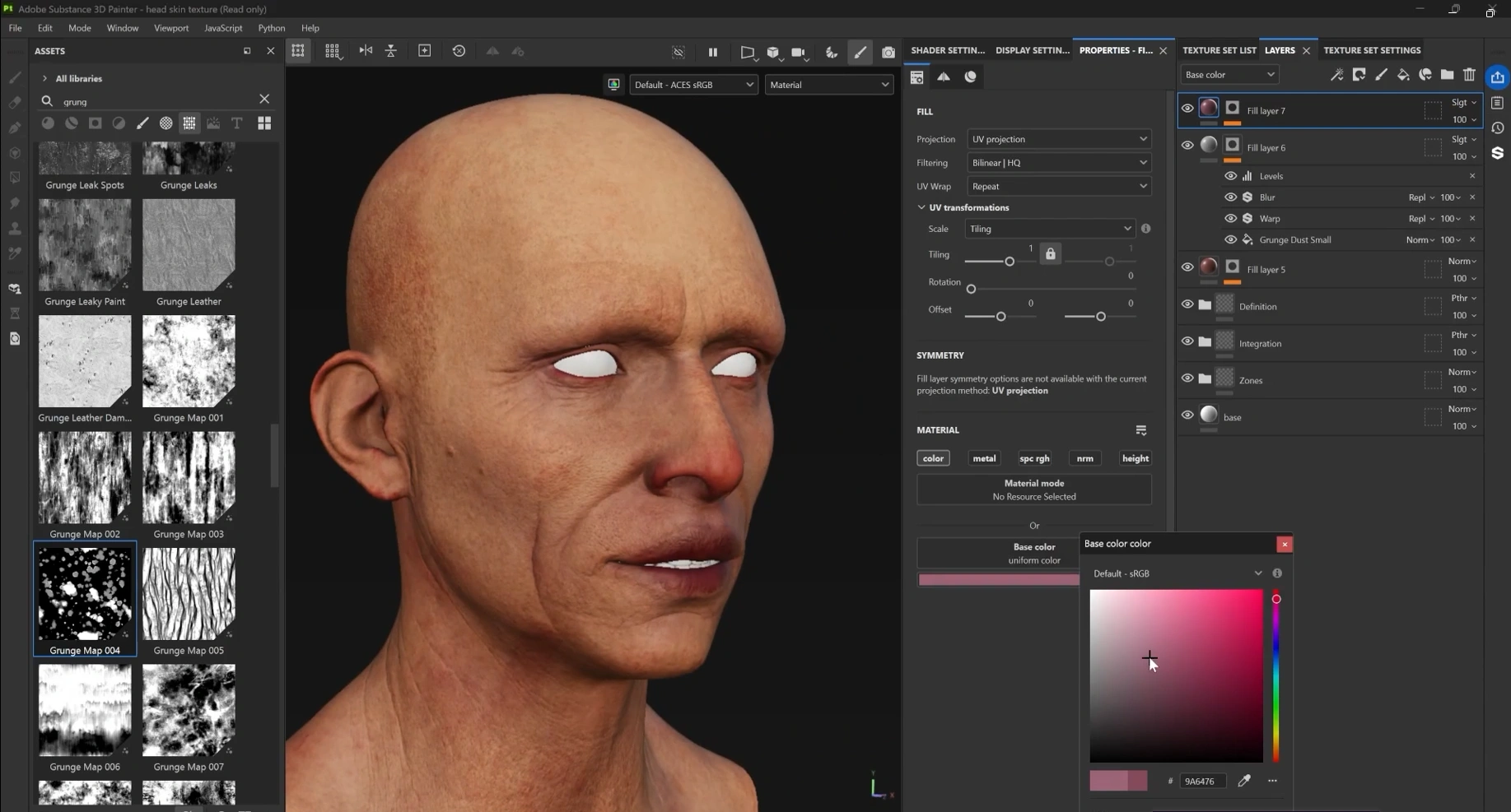
Start with Grunge Dust Small in a mask. You can drag the texture directly onto the mask to add it as a Fill effect.
- Adjust tiling to establish the spot size.
- Increase balance and contrast to remove unwanted mid-grey coverage.
- Add a small Warp to make the shapes less regular.
- Add Blur to soften the edges.
- Use Levels to control the remaining coverage.
Try a muted pink or darker pink colour with Soft Light. Keep it subtle enough that it enriches the skin without looking like a layer of dirt.
Build a broader redness mask
For larger variation, begin with a softer dirt grunge containing more grey values. Add another organic grunge above it and experiment with how they combine:
- Multiply darkens the mask; white leaves the lower result unchanged.
- Screen lightens the mask; black leaves the lower result unchanged.
- Overlay introduces contrast.
- Subtract removes coverage according to the upper effect.
- Lighten or Linear Dodge can add brighter mask information.
Add Warp and Blur to break up and soften the result. A further contrasting grunge can introduce scattered details, and a Curvature generator can help tie the mask back to the face.
When using that Curvature generator, choose the unprocessed curvature contribution if you want the original baked information rather than an edge-focused result. Finish with Levels to control the combined mask.
This stage is experimental. There isn’t one blending mode that works for every combination. Try a mode, inspect the mask, then check the material.
Set the fill colour to a desaturated red or pink and try Overlay or Soft Light. Blur harsh transitions and paint away anything that resembles an accidental sunburn. Add warmth selectively around the nose, ears and other chosen areas, then lower the overall opacity.
Step 12: Paint asymmetrical moles and freckles
Turn symmetry off before adding individual identifying marks. These details should feel placed, not mirrored.
Create a new fill layer with a black mask and a Paint effect. Use a simple hard brush to place a few dots, then process the mask with:
- Blur to soften the initial marks.
- Warp to disturb their perfect roundness. Adjust source tiling and keep the intensity low.
- A second subtle Blur to soften the warped edges.
Once those effects are in place, every new dot you paint receives the same treatment. You can concentrate on placement while the mask stack handles the edge quality.
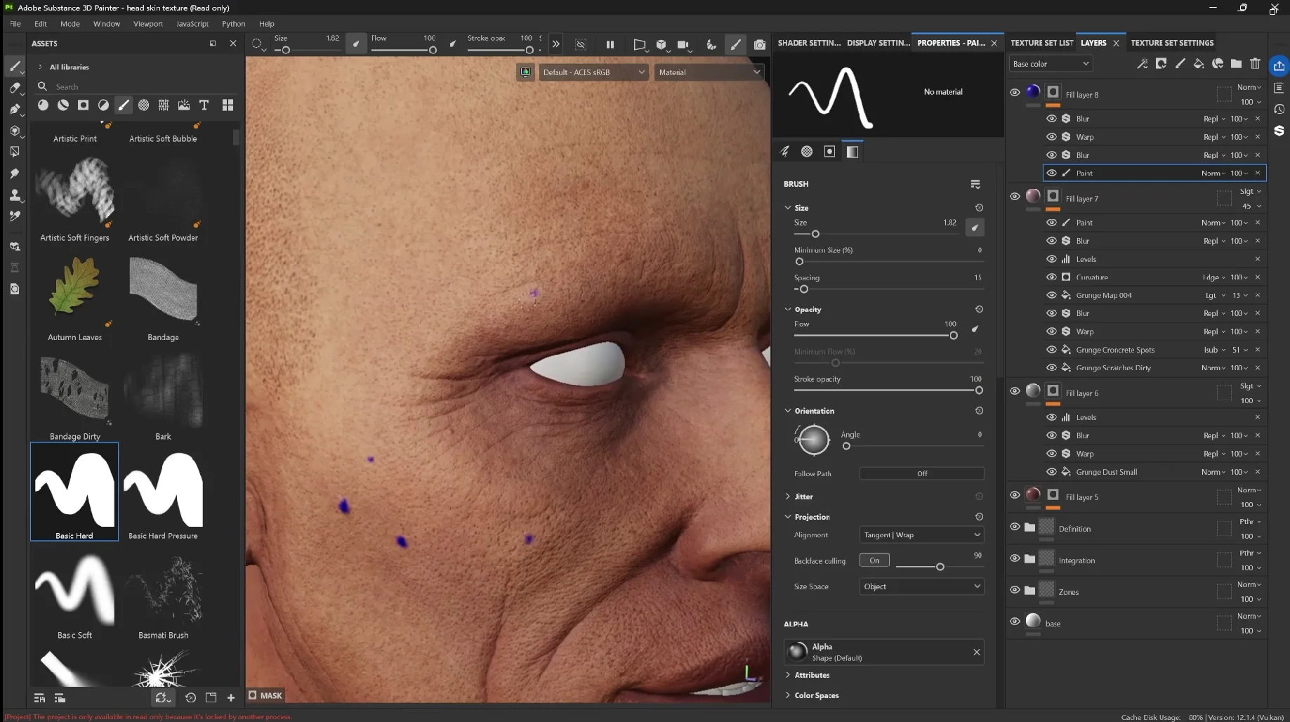
Follow existing sculpted marks where useful, and add a few new ones where the face needs variation. Change the fill to a muted darker tone and reduce the intensity. Some marks can remain stronger than others; they don’t all need to read as equally dark moles.
Step 13: Create surface and deeper vessels with Marble Veins
This is one of my favourite parts because it’s a simple setup with a lot of control.
Create a fill layer with a black mask and add Marble Veins as a Fill effect inside it. Adjust tiling until the lines are fine enough for the face, then use a restrained darker colour.
The pattern will initially cover far too much of the head. Don’t worry about placement yet. First, establish two slightly different vessel layers:
- Surface veins: the finer, slightly sharper layer.
- Deep veins: a duplicated layer with different tiling, rotation and balance, plus a darker grey-purple colour.
Those differences help suggest different perceived depths. Blur the deeper layer more than the surface layer so both don’t look equally close to the surface.
In this example, a blur around 0.1–0.15 is used for the deeper pattern, with a much smaller blur around 0.05 for the surface pattern. Treat these as starting points and judge the result on your own mesh.
Control both patterns with a folder mask
- Reduce the opacity of both vessel layers.
- Group them into a folder.
- Add a black mask to the folder to hide both patterns.
- Add a Paint effect to the folder mask.
- Use the Dirt brush to reveal vessels only where needed.
Concentrate on selected areas near the eyes, nose, nostrils and cheeks. You don’t want an evenly visible network across the entire face.
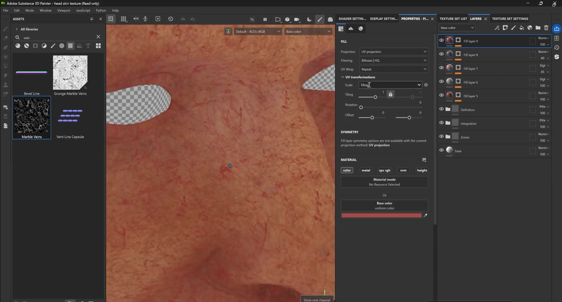
The folder mask controls placement, while the two layers inside control pattern, colour, sharpness and intensity independently. That separation makes later revisions much easier.
Step 14: Reintegrate noisy areas and add the final crevice pass
After adding so much variation, the face can become too spotty. This is a good moment to step back and simplify.
Create a new fill layer with a clean, light, relatively desaturated skin tone. Add a black mask and paint gently over areas that have become too noisy. A brush such as Concrete Light works well, but the exact brush is less important than the soft, irregular coverage.
Use symmetry for this broad reintegration if it helps. Add Blur if the brush edges are harsh, then lower the layer opacity until the underlying variation remains visible.
You aren’t removing the work… you’re bringing it together. Up close, the skin should still have plenty of detail. From further away, it should feel unified again.
For one final accent, create another inverted curvature mask with Levels. Use a darker reddish colour with Overlay, soften it with Blur, then paint away unwanted coverage. Reduce the opacity until it adds only a small amount of definition to the crevices.
Group the finishing layers into Details and set the folder’s colour blending mode to Pass Through where required.
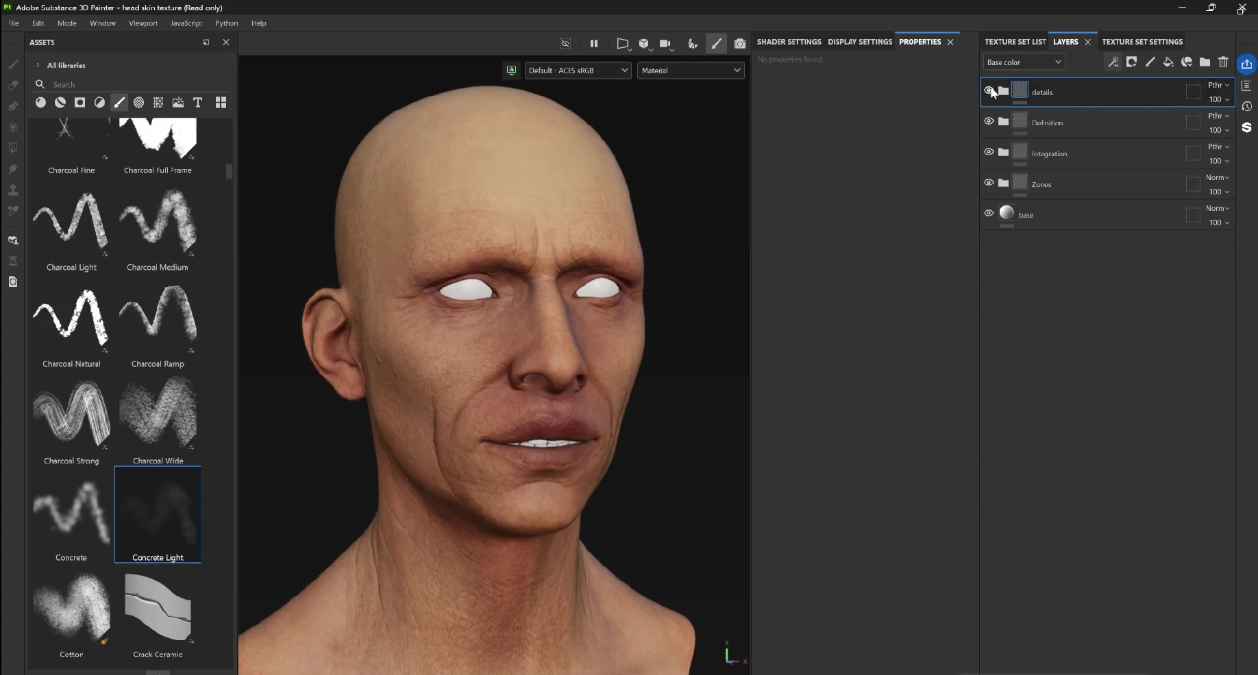
Step 15: Check the complete texture at different distances
Now review the four folders one at a time, in both Base Color and Material view:
- Zones should establish the broad warm and cool relationships.
- Integration should turn those colours into a coherent skin base.
- Definition should make the facial features and colour variation more readable.
- Details should add complexity without taking over the face.
Zoom in to check the small marks, then pull back to judge the overall colour. If every detail is obvious from a distance, some of the layers probably need to come down.
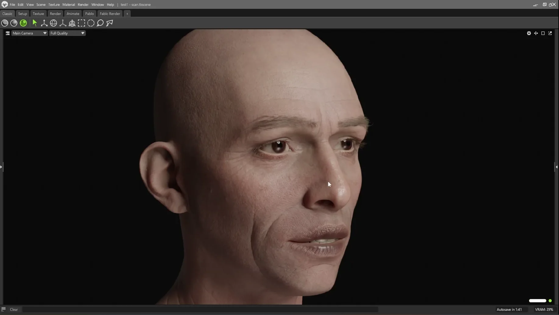
Export the textures and test them in your intended renderer, such as Marmoset. If an effect looks too intense there, return to Painter and adjust the relevant fill colour, mask or opacity. That’s the value of keeping the setup non-destructive.
Quick troubleshooting:
- The skin feels flat: check that integration hasn’t completely covered the underlying zones, then review the definition layers.
- The face looks dirty: soften harsh masks, reduce spot coverage and use the reintegration pass.
- A procedural pattern is recognisable: change tiling, add restrained Warp and Blur, and finish with painted corrections.
- Grouping changes the colour: check the folder’s Base Color blending mode and use Pass Through where needed.
- Wrinkles look outlined: reduce the curvature layer’s contrast, colour strength or opacity, and soften the mask.
- Vessels dominate the face: lower the individual layers and reveal less through the folder mask.
- Colour samples look too dark: hold Shift while sampling to pick base colour rather than shading.
The same structure can be adapted to a creature, zombie or another skin treatment by changing the palette and adjusting the material response later. More distinctive features… scars, stronger sun exposure, acne or larger moles… can live in the Details folder without disrupting the base.
The main idea is simple: start with broad colour relationships, integrate them, define the features and add details with restraint. Skin doesn’t need to look complicated from every distance. It needs enough subtle variation to reward a closer look.

SP101 video
Stop guessing your way through Substance. SP101 is the structured, project-based course that teaches you a real system for taking any asset from grey mesh to finished render.
Check it out