





ZBrush has a lot of small features hidden in the Preferences palette that can quietly make navigation easier, selections faster, and sculpting clearer. They are not dramatic “secret tools,” but they are exactly the kind of small quality-of-life changes that compound over time.
In this guide, I’ll go through five useful settings that are worth trying:
- Gesture controls for zooming
- Single-click Solo mode on the canvas
- Adjusting gizmo modifier length
- Custom ghost and transparency settings
- Cleaner, more readable polyframe display
Some of these are the sort of thing you will instantly love. Others might feel strange at first. Either way, they are worth knowing because they let you shape ZBrush around the way you prefer to work.
1: Enable gesture controls for quick zooming
The first setting lives in Preferences > Edit. There you’ll find an option to enable gestures.
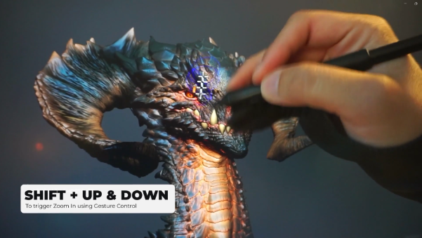
When this is turned on, ZBrush lets you control zoom with simple pen or mouse movements while holding Shift. It is one of those features that often goes unnoticed, but once it clicks, it can feel surprisingly fluid.
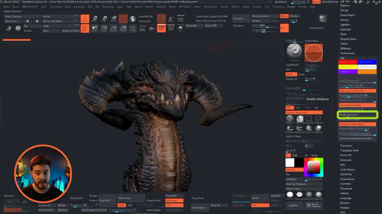
The basic idea is this:
- Hold Shift and move up and down over the area you want to focus on to zoom in.
- Hold Shift and make a circular motion to zoom back out.
This allows you to aim at a specific part of the sculpt and dive straight into it without relying only on the usual navigation habits.
For example, if you are working around the eye socket of a creature head, you can hover over that region, use the up-and-down gesture a couple of times, and quickly tighten the view around that exact area. Then, when you need broader context again, use the circular gesture to pull back out.
A few practical notes:
- It takes a little practice before it feels natural.
- It works best when you already know the area you want to target.
- Some artists find it faster than standard navigation, while others never really warm up to it.
That last point is important. This is not a universal “better” way to navigate. It is simply another control option that may suit your hand movement and rhythm better than the default approach.
If the gestures feel awkward at first, give them a proper trial before dismissing them. They are unusual, but once learned, they can be very handy for quick sculpt focus changes.
2: Use single-click Solo mode directly on the canvas
The second setting is also in the same area of the Preferences palette, right below gesture controls. It is called Allow Click on Solo.
This one is extremely simple: once enabled, a single click on the canvas toggles Solo mode for the selected subtool.
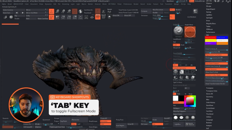
If you already use Solo a lot, this can remove a surprising amount of friction.
Normally, isolating a subtool means either clicking the Solo button or using a shortcut. Both are fine. But if you often work with a minimal interface, or in full screen mode, having Solo available directly from the canvas feels very immediate.
A practical way to use it looks like this:
- Select a subtool, such as the eyes, horns, or head.
- Click once on the canvas to isolate it.
- Work on that piece without the surrounding clutter.
- Click once again on the canvas to bring everything back.
This is especially useful when switching between focused sculpting and full-character context over and over again.
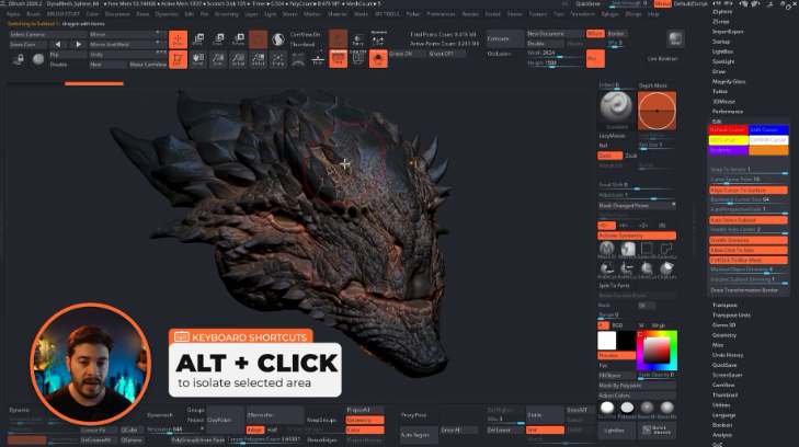
For instance, on a creature sculpt:
- Select the eyes, click once, refine them, click again to return.
- Select the horns, click once, adjust forms, click again to return.
- Select the head, click once, make changes, then click again to restore the full setup.
If you like working in a distraction-free layout, this setting fits very nicely into that kind of workflow. You can hide the interface with Tab, maximize the canvas, and still toggle isolation quickly without hunting for buttons.
Again, this is one of those “you’ll either love it or hate it” changes. But even if it does not become part of your daily setup, it is worth knowing that the option exists.
3: Make gizmo modifiers easier to grab by changing their length
The third tip is a small adjustment with a big usability payoff, particularly if you use gizmo deformers like Bend Curve or Bend Arc.
Inside Preferences > Gizmo 3D, ZBrush lets you adjust the size of the gizmo elements, including the modifier length.
This controls the visible cone-like handles used by various gizmo modifiers. By default, they can feel a bit too small, which makes them fiddly to select accurately.
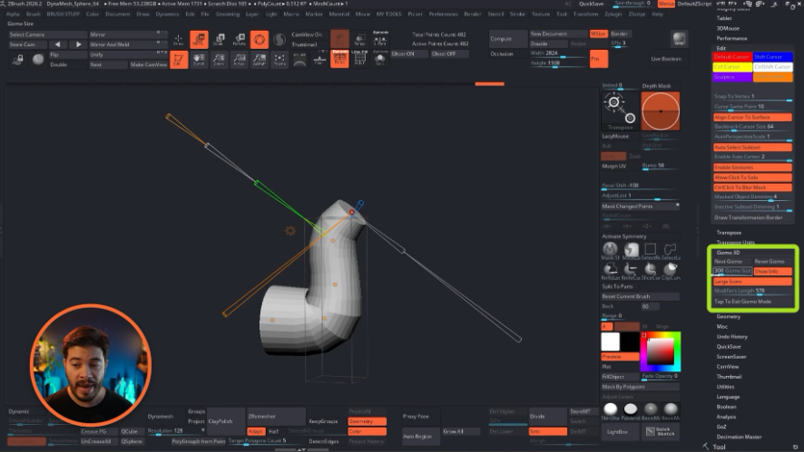
Why does this matter?
Because when shaping something like a tube, neck, tail, horn, or tentacle with Bend Curve, the control points and their handles become part of the modeling experience. If those controls are too tiny, the tool itself becomes less pleasant to use.
A simple example is building a curved dragon neck from a cylinder:
- Start with a basic cylinder.
- Activate the gizmo.
- Open the gear icon.
- Choose Bend Curve.
- Add and move curve points to establish the overall shape.
- Scale specific points to taper areas as needed.
That workflow is already quite powerful. But it becomes much easier when the modifier handles are long enough to grab comfortably.
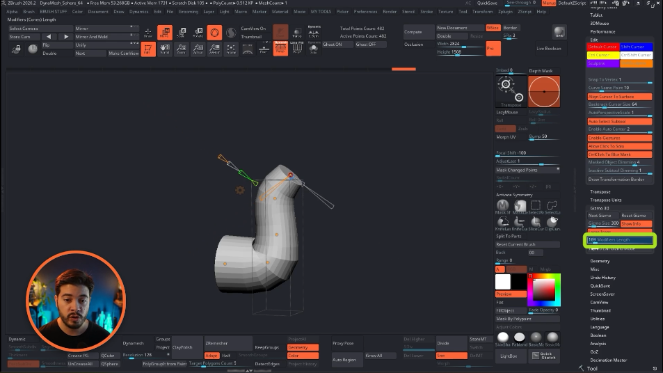
In the Gizmo 3D preferences, the main settings worth checking are:
- Modifier Length – changes how long the modifier cones/handles appear
- Gizmo Size – changes the overall size of the gizmo
- Large Icons – can be turned off if you want a smaller visual footprint
The most important of these, in this context, is the modifier length. Increasing it gives you more forgiving handles and makes selection less annoying.
This is the kind of setting people often never touch simply because they do not realize it can be changed. But if you regularly use gizmo-based deformation, it is definitely worth customizing.
4: Improve ghost transparency so it actually helps sculpting
This is probably the most impactful tip in the list.
ZBrush’s Transparency and Ghost modes can be incredibly useful when sculpting around overlapping forms, but the default look is not always the clearest. With a few adjustments, this feature becomes much more practical.
The core problem it solves is this: when another visible subtool sits in front of or close to the one you are editing, your brush can start reacting to both volumes.
That can create unwanted deformation.
Imagine sculpting the skull area of a dragon while large fangs sit close to the surface. If those fangs remain visible in a normal state, your brush may “see” them too and produce strange results. In many cases, the default solution is to isolate the active subtool in Solo mode.
But there is another option: use Transparency + Ghost.
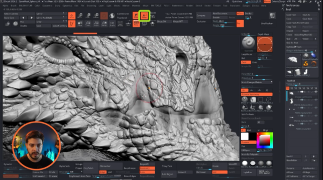
With those enabled, the overlapping subtool remains visible enough to guide your sculpting, but it no longer interferes in the same way. That means you can push or refine the active surface while still seeing the obstructing part for context.
This is useful in many situations, including:
- Fangs, teeth, horns, or spikes sitting near skin surfaces
- Clothing layers over a body
- Accessories intersecting with anatomy
- Stitches or seam details where you want to bulge surrounding forms without affecting nearby objects
To make the behaviour easier to understand, think of a simple sphere with a ring passing around it.
If you sculpt on the sphere while the ring is visible in the usual way, the brush can react badly when it approaches that ring. If you switch on transparency and ghost mode, you can still see the ring as reference, but sculpt the sphere more cleanly without that interference.
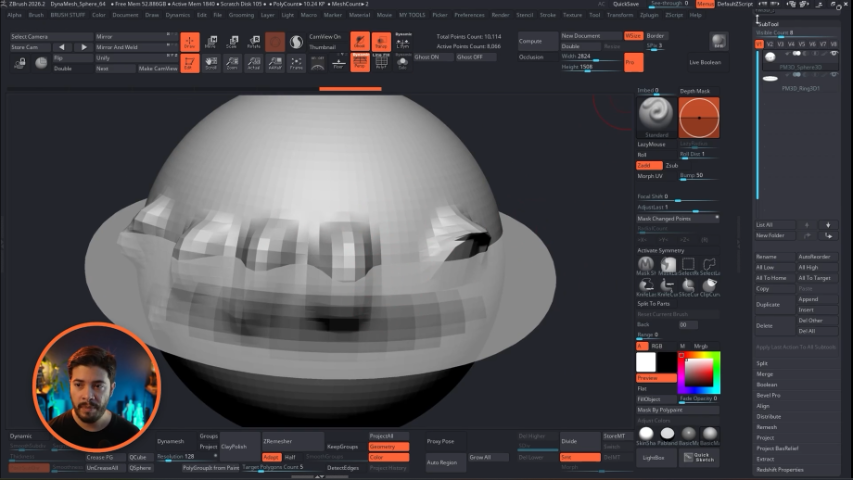
The real improvement comes from customizing the display in Preferences > Draw.
The main settings to adjust are:
- Transparent Depth
- Front Opacity
- Back Opacity
- Ghost Color
A practical setup is:
- Choose a bright ghost color, such as a vivid orange, so the active target is easy to read.
- Adjust Transparent Depth until the front-facing transparency feels clear rather than washed out.
- Increase or fine-tune Front Opacity to strengthen the visibility of the ghosted object.
- Set Back Opacity very low or all the way to zero if you do not want to see through the entire object to its far side.
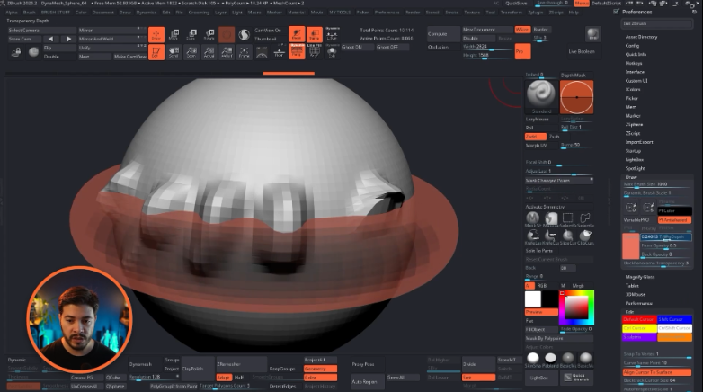
That last slider is particularly important.
Seeing through to the far side of the mesh can sometimes be useful, but in many sculpting situations it just adds visual noise. Reducing the back opacity gives you a much cleaner read: enough to understand the overlapping form, but not so much that the model becomes visually confusing.
A few workflow notes:
- Ghost mode is often most useful when paired with Transparency rather than used conceptually as a separate feature.
- If you toggle this mode often, it can be worth creating a macro to switch both on and off together.
- If you do not want to build a macro, simply keep Ghost enabled and assign a shortcut to Transparency, since Ghost depends on it.
This is a deceptively small customization, but it can save a lot of time when sculpting around dense or layered forms.
5: Customize polyframe so the model is easier to read
The last tip is about clarity.
ZBrush’s default polyframe display is functional, but not always the easiest on the eyes. If you want something closer to a cleaner DCC-style wireframe look, or simply a more controlled way to read topology and subtools, you can customize that too.
Most of the relevant controls are in Preferences > Draw.
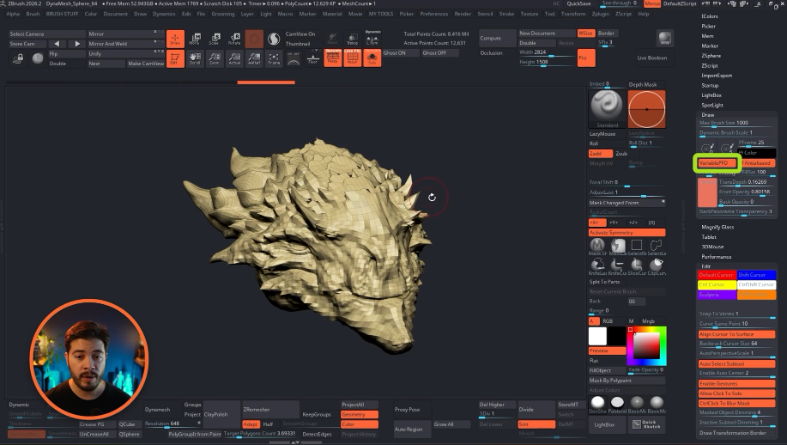
A good first option to turn on is Variable Polyframe Opacity. This helps adjust the visibility of the lines depending on whether subdivision levels are present, and for many setups it is a nice default behaviour to keep active.
From there, you can start shaping the overall look.
There are really two directions you can take:
- Create a mostly neutral grey shaded polyframe with a specific wire color
- Keep the polygroup colors, but reduce their intensity for a softer look
Build a cleaner grey-and-wireframe look
If you like the familiar look of a grey shaded model with blue wires—similar to what many artists associate with a classic Maya-style display—you can get quite close in ZBrush.
The key settings are:
- Polyframe Color – controls the outline color
- PF Gray – forces the surface into grey rather than displaying full polygroup colors
- PFrame – controls polyframe color intensity
- PFill – controls the fill amount of the surface color underneath
Here is a simple approach:
- Choose a wire color as your main color, for example blue.
- Click the polyframe color control so ZBrush uses that as the wireframe color.
- Enable PF Gray so the mesh stays in a neutral grey mode.
- Increase PFrame if you want brighter or clearer wire lines.
- Adjust PFill if the fill feels too strong or too flat.
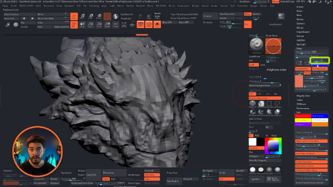
This gives a much more controlled technical display, which can be especially nice when checking edge flow or simply reducing the visual chaos caused by strong random polygroup colors.
It is worth clarifying something here: with PF Gray enabled, the model can still have different polygroup IDs internally. You are just choosing not to display them as strong random colors.
Or keep polygroup colors, but make them less aggressive
If you do want to preserve the color distinction between different parts, but the default polygroup display feels too saturated, there is a middle ground.
Instead of forcing everything to grey, you can reduce the Polyframe Color Saturation.
This lets the polygroups retain subtle color variation while avoiding the very loud, high-contrast look that can make the model harder to read.
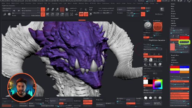
That means:
- You still see which object or region is different
- The color coding is more understated
- The wireframe can remain prominent if desired
For some artists, this is the sweet spot. You keep the organizational benefit of color, but the display looks more refined and less distracting.
And if needed, you can still assign new polygroup colors the usual way with Ctrl + W and then control how intensely they appear through the polyframe settings.
Treat these as workflow preferences, not rules
What makes all five of these tips useful is not that they are universally “better” than the defaults. It is that they allow you to personalize ZBrush so it supports the way you actually work.
Some artists will immediately adopt click-on-canvas Solo mode and never go back. Others will ignore that one completely but get huge value from custom ghost transparency. Some will love gesture zoom; others will try it for ten minutes and decide it is not for them.
That is perfectly fine.
The real takeaway is that ZBrush already includes a lot of flexibility in the Preferences palette, and small adjustments there can make the software feel much more responsive to your habits.
These are the five settings covered here:
- Gesture Controls for zooming in and out with Shift-based motions
- Allow Click on Solo for fast canvas-based isolation
- Gizmo Modifier Length for easier deformer handle selection
- Custom Transparency and Ghost for cleaner sculpting around overlapping forms
- Polyframe customization for a clearer, more readable display
None of them will completely transform sculpting on their own. But together, they can make ZBrush feel more intentional, more comfortable, and easier to read.
Final thoughts
There is a lot of value in learning new tools, but there is also a lot of value in refining the tools already in front of you. These small ZBrush settings are a good example of that. They are lightweight changes, easy to test, and they can quietly remove friction from everyday tasks.
If a ZBrush setup has started to feel a bit rigid, this is a good place to experiment. Open the Preferences palette, test these one by one, and keep only the ones that genuinely improve your workflow.
That is usually where the best optimizations come from anyway—not from chasing complexity, but from making the defaults work better for the way you think and sculpt.
Scales Brushes Pack
This is a collection of brushes designed to simplify the sculpting and detailing process for scales, scutes and reptilian skin patterns in ZBrush, allowing you to quickly establish convincing scale structures and surface variation on your meshes. The brushes in this pack are built to give you control over the placement and rhythm of scales, whether you're creating tight reptile skin, large armored plates, or subtle textured surfaces.
Get resource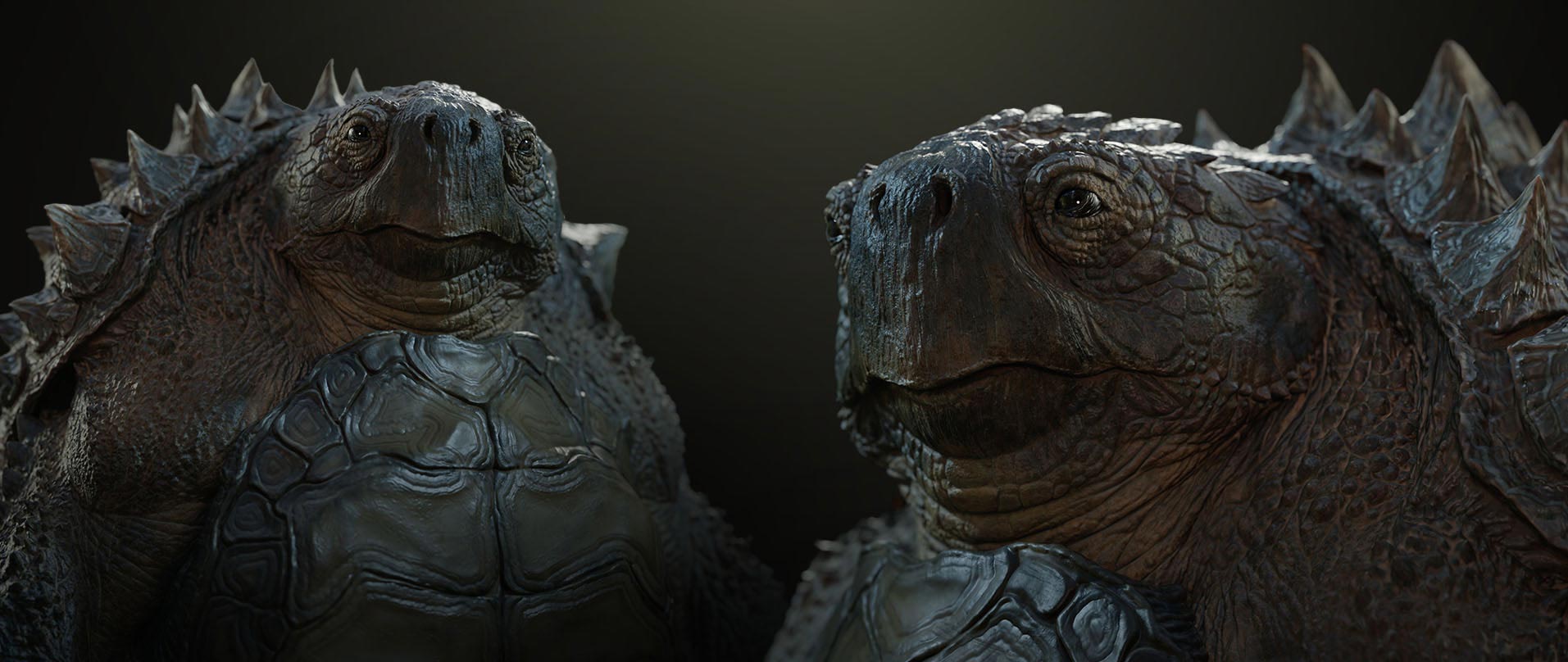
How I made this Dragon - From Start to Finish
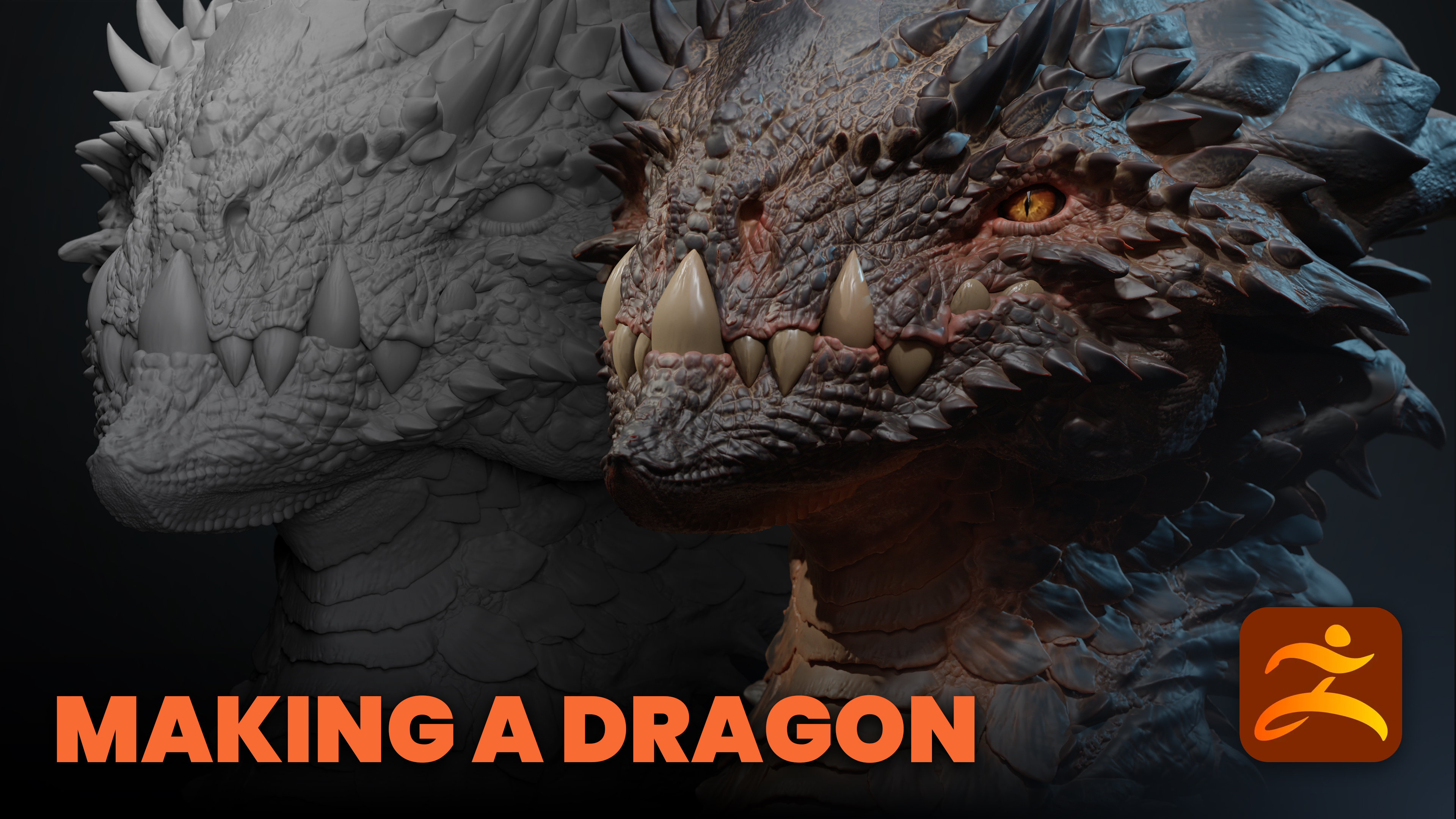
Sculpting a complex concept like this dragon is actually simpler than you might think when you stick to a structured workflow. I put together a breakdown of the entire process, from blocking out primary volumes in ZBrush to the final presentation in Marmoset Toolbag 5.
Check it out